7 - Color
MODULE #7
COLOR
Color has taken possession of me; no longer do I have to chase after it.
I know that it has hold of me forever... Color and I are one. I am a painter.
- Paul Klee
Introduction
Color is an exciting, elusive, and enigmatic component in art-making. It is highly variable due to lighting, neighboring colors, and cultural, psychological, emotional, and even political references. And, while color is not the most primary element in a painting, it has the power to set a mood, guide the eye and draw in the viewer. For some people, color is the first thing that commands their attention.
Our goal is to acquaint you with the basics of color, give some fun and exploratory exercises that may inspire you to set out on your own passionate journey, and make color a regular part of your studio practice.
Due to the vastness of the study of color, we will barely scratch the surface here. It is our intention to make color interesting and fun through learning techniques for exploring color. We hope that with a new appreciation and understanding of color you will feel more free and confident in expressing yourself with color in your own unique way.
We will also be offering more courses in color to help you deepen your understanding, and further enrich your studio practice in this exciting and challenging realm for making dynamic art.
So that you may begin to understand color, we have prepared a short video for you which explains the basic terminology used in the study of color.
The three properties of color are hue, value and saturation.
HUE
Hue is the term for the pure spectrum colors commonly referred to by the name on the color wheel - red, orange, yellow, blue, green, violet, etc.
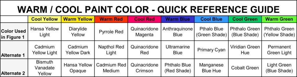
To get a bit more detailed, each hue is made up of a range of wavelengths which includes warm, neutral, cool aspects of the hue. Hence, a red is either a cool red, a warm red or a more neutral red. Here, we show cadmium red deep which is cooler, ie, has more blue in it, cadmium red medium which is more neutral, and cadmium red light, which is warmer with a bit more orange tone. Many painters work with both a warm and a cool hue to give a richer, more full-bodied color.

The color wheel was created as a way to visualize and understand the properties of color. It is the bending of the visual spectrum into a circular arrangement; divided into 12 distinct hues, starting with the three primary hues of red, blue, yellow which are equidistant from one another. The primary colors - red, blue, and yellow - cannot be mixed or formed by any combination of other colors. All other colors are derived from the primary colors.
Chroma---another word for hue.
VALUE
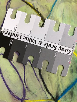
Value the relative lightness or darkness of a color. Hues have value inherent in them. Yellow, for example, is a very light value while blue-violet is a very dark hue. Hues can be made lighter by adding white and darker by adding black. A good way to check the value of a color is to use the value finder.
When an image is made up of light values we say it is high key, and when it is made up of dark values we say it is low key.
An important concept to stay aware of is that the eye loves contrast or differences.
If the entire painting is chromatic and intense…it’s as if the work is screaming at us….there’s no nuance…no conversation between loud and quiet…shouting versus whispering… and our eyes turn away from visual fatigue…and the painting feel predictable rather than full of surprise and wonder….
Just as the eye loves differences in value, weight of line, shape and so forth…so too does it love the contrast between values of hues.
SATURATION
Saturation is the purity of the hue. A color loses it saturation when grey, black, white or any other hue is added to it. When white is added to a hue, the hue gets lighter as it loses it saturation. White + Hue = Tint. When black is added to a hue, the hue gets darker as it loses it saturation. Black + Hue = Shade. When grey is added to a hue, the more grey, the less the saturation. Grey + Hue = Tone. See the example below.

COLOR WHEEL TERMINOLOGY
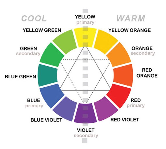
Primary Colors - Red, blue and Yellow - 3 pigment colors that cannot be mixed or formed by any combination of other colors. All other colors are derived from these 3 hues.
Secondary Colors - Green, orange and purple - are formed by mixing two primary colors.
Tertiary Colors - Yellow-orange, red-orange, red-purple, blue-purple, blue-green & yellow-green - formed by mixing a primary and a secondary color. That's why the hue is a two-word name, ie, blue-green.
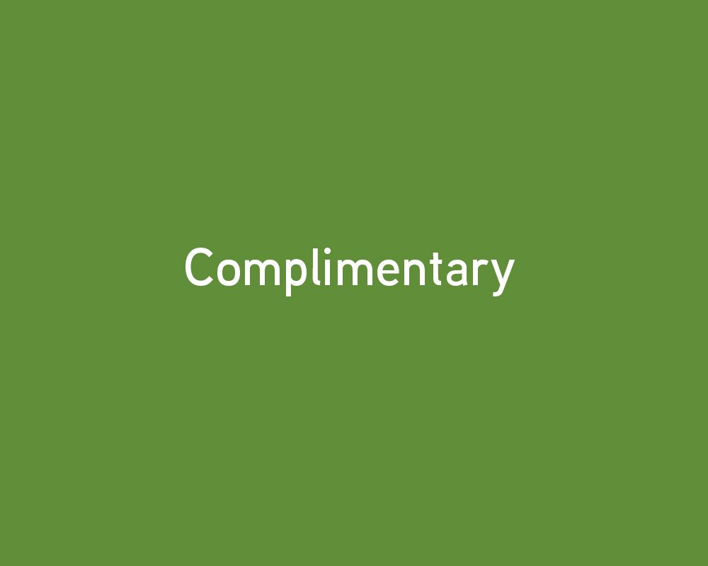
Complimentary Colors - Colors opposite one another on the Color Wheel.
Red & Green
Red-orange & Blue-green
Orange & Blue
Yellow-orange & Blue-purple
Yellow & Purple
Red-purple & Yellow-green
Analogous Colors - Analogous colors are groups of three colors that are next to each other on the color wheel and a tertiary. For example, red, orange, and red-orange or red, orange, yellow.
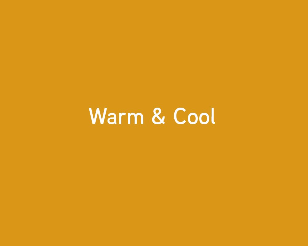
Warm and Cool Colors -
Warm colors evoke warmth because they remind us of things like the sun or fire. ie, red, yellow, orange, red-violet
Cool colors evoke a cool feeling because they remind us of things like water or grass. ie, blue, green, purple
Triadic Colors - three colors which are evenly placed around the color wheel. The resulting effect is a vibrant scheme, even with low saturation. For example, orange, green, violet.
Monochromatic Colors - A single hue. Variations of the color are created by changing the value and saturation of the color.
Achromatic Colors - An achromatic color is a one that lacks hues such as white, grey and black, and a chromatic color is a color which has even the slightest amount of hue.
Using Color in a Painting
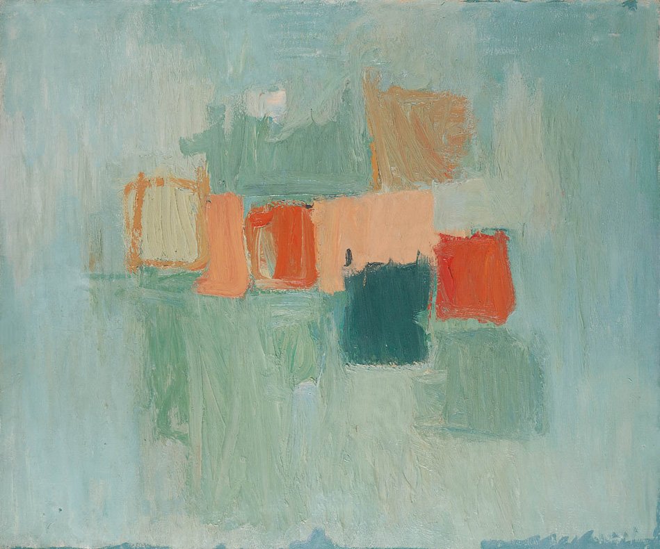
Harmony - refers to the property that certain aesthetically pleasing color combinations have. True color harmony relies on a complex interplay between all the colors in the painting. When mixing think of it as a beautiful dance between all the different tints, shades, tones, temperatures, and hues. Each color in an image needs to 'fit in' in order for colors to appear harmonious. Using color schemes is one way to create harmony.
Sample color schemes:
complimentary
warm & cool
analogous
triadic
monochromatic
Weight - What determines the weight of each color? There are three factors, and if we add one of them we need to compensate with one of the others (or both).
The size of the area
The saturation
The brightness
For example, in a large area, colors must either be made light or desaturated to obtain the same optical weight.
Balance - Color balance is the distribution of the visual weight of the hues in a painting which provides unification of structure and composition.
Slide Show
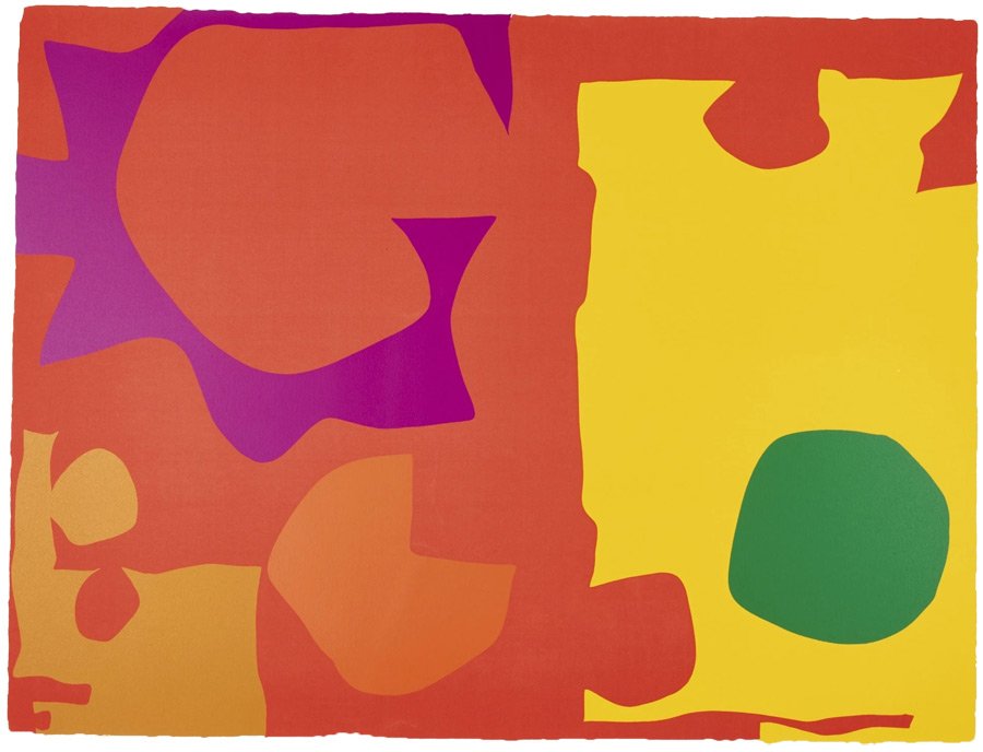
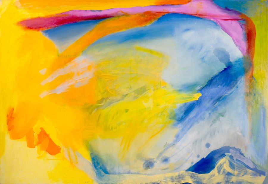
The following slide show will help you see how artists have used the power of color to create strong, compelling paintings.
MATERIALS :
Heavy bodied acrylic paint:
black, white, cadmium yellow, cadmium yellow deep, cadmium red light, medium and dark, ultramarine blue, cobalt blue, cerulean blue.
Mixed Media Canson Workbook 9" x 12" or 11" x 14"
Palette knife, palette paper pad 11" x 14"
5 to 15 small plastic containers with lids
Tools of your choice: shapers, scrapers, brayer, etc.
Paint brushes of your choice
4 to 6 sheets of heavy weight mixed media paper 30" x 22
Misc. studio supplies - bucket, spray bottle, paper towels, etc
EXERCISE #1
The Color Wheel Video
Materials: Cadmium yellow light, cadmium red medium, and ultramarine blue, mixed media workbook, palette knife, palette paper, paper towel, water, sample of color wheel.
Make a color wheel by using the three primary colors of red, blue and yellow in your workbook. Label all the colors on the color wheel.
Note: This exercise is great practice for increasing skill in mixing the mid values of hues. It also helps become familiar with the 12 hues on the basic color wheel, which ones are secondary colors, which ones are tertiary colors, and their relationship to one another. You can use this color wheel to help make color scheme choices.
EXERCISE #2
Exploring Monochromatic Color
Materials: White, black, cadmium red light, cadmium medium, and cadmium red dark, workbook, palette knife, palette paper, water, paper towels, brushes, scraper, shaper. An alternative set of red colors could be Naphthol crimson, alizarin crimson, cadmium red medium.
Taking a warm red and a cool red and white and black, make a composition in your mixed media workbook using the tints and shades and the fully saturated cool red and warm red. Notice that by mixing the two reds together, a true red hue is obtained. Work intuitively and make the composition in any way you wish. Notice the impact the cool red has on the warm red and the impact that tints have on the shades. Notice the variation in colors using the two different reds with white and black.
You may wish to do this exercise with a warm and cool blue and/or a warm and cool yellow to experience the effects of each and to explore the combinations of tints and shades and their effects on their warm and cool counterparts.
EXERCISE #3
Analogous colors
Materials: Mixed Media Workbook, two to three analogous colors, black and white, palette knife, palette paper, tools, water, paper towel
Whatever analogous colors you choose on the color wheel, you will need to mix the tertiary colors. The first part of the exercise is to take the two outer colors of the ones you have chosen for your analogous colors and have fun making a whole page in the workbook of intuitive mixtures and make some with white and black. You want to explore the range of values and the range of hues that you can expect when working with the chosen analogous grouping.
Make a small composition in the workbook using combinations of values and hues as you wish.
EXERCISE #4
Working with the Intensity of a Hue
Materials: Same as Exercise 2.
Take one color, white and black. For example, taking red white, and black. Mark a 6” square in the middle of the page. Start with a fully saturated red and place a small amount within the 6” frame. In this exercise, you are going to see how much area of a tint or shade is needed to balance the “weight” of the fully saturated color. So, add a very little amount of a shade of the color and add enough of the tint of the color to create a balance so that the small area of the intensity of the hue feels like the same weight as the large area of a tint and shade of the hue.
EXERCISE #5
Balancing the Weights of the Intensities of Two Hues
Repeat exercise #4 using two colors, white and black.
BONUS
There is so much material to cover on the topic of Color that in this Color Bonus Section, we offer more exercises and ways to understand color when making a painting through harmony, moods, and atmosphere.
BONUS EXERCISES
#1 Mixing Colors to Create Harmony
There are many ways to create color harmony in a painting. Besides using the analogous color scheme which is the easiest way to create harmony, we will explore mixing colors as another way to achieve this important principle of composition. This is only one way that mixing colors will create harmony.
Materials: primary colors, palette knife, mixed media workbook, paintbrushes, water, paper towels, and palette paper.
Divide the page in two by drawing a line midway in your mixed media workbook. Take a red, blue, and yellow and create a small quick composition at the top ½ of the page.
On a piece of palette paper, but a quarter’s amount of each color, red, blue, and yellow at the top. Mix equal amounts of part of the red, blue, and yellow together in the center of the palette paper. You will note that this mixed color is a very muddy looking color or even perhaps a blackish color.
Now, make three new colors at the bottom of the palette paper, each with a very small amount of the “muddy” color plus red, blue, and yellow respectively. Now you have a muted red, blue, and yellow which look more harmonious since they all contain some of the “muddy” color.
Make a small intuitive composition at the bottom of the page in the workbook using these three “new” colors.
Compare the top composition to the bottom composition. Notice the difference in energies. On the top composition, the colors seem to repel one another, or spark one another. There seems to be more energy and not much “rest” for the viewer. Look at the way the colors seem to blend together more and feel more harmonious in the bottom image. Notice which one aids eye blow, which one is softer, which energizes, which one draws the viewer in and which one has the color come out to the viewer.
Now, add just a dash of the original pure red, blue and yellow on the bottom composition. Notice how the small pure color adds an energy that enlivens but does not pull the composition apart.
Which image do you prefer? This is a great way to experiment with color and how you might want the colors to blend or ignite one another.
#2 Creating a Mood with Color
Materials: 2 colors, black and white, mixed media workbook, palette knife, palette paper, water, paper towel, brushes, scrapers, shapers.
In your mixed media workbook, draw a line dividing the page into two equal parts. Settle yourself into your body by taking some deep breaths. Feel the emotion that is going on inside you at this time. Choose 2 colors that represent this mood as well as white and black. Using these colors, create a small area expressing this mood.
After you have done this, quickly and intuitively, take a look and see if it reflected the mood you felt accurately. Did the colors you chose seem like the right ones? Did the amount of space you allocated feel appropriate to your mood? Did the brush strokes feel expressive and representative of the mood?
Repeat the above on the bottom half of the page now that you have a better understanding of what you felt and how to express it in color, proportion, tools.
Compare the top ½ and the bottom ½ of the page and decide which one comes the closest to expressing the mood you felt.
This is a great exercise to explore different internal expressions of mood with color and the technique of applying the paint. We hope you do it over and over with many different kinds of moods. It will enhance your paintings to be able to share your feelings with your viewers in a more dynamic way.
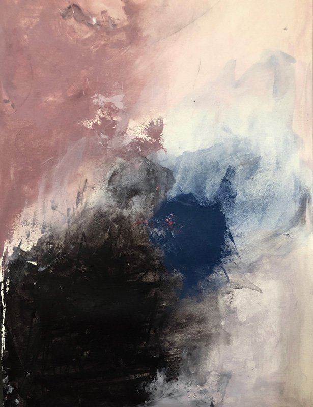
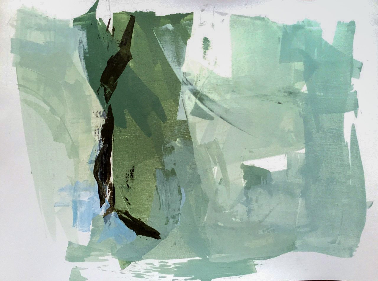
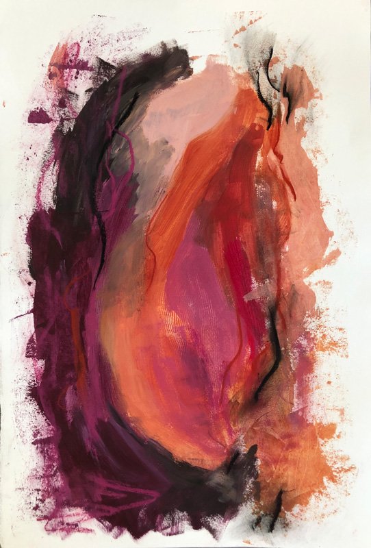
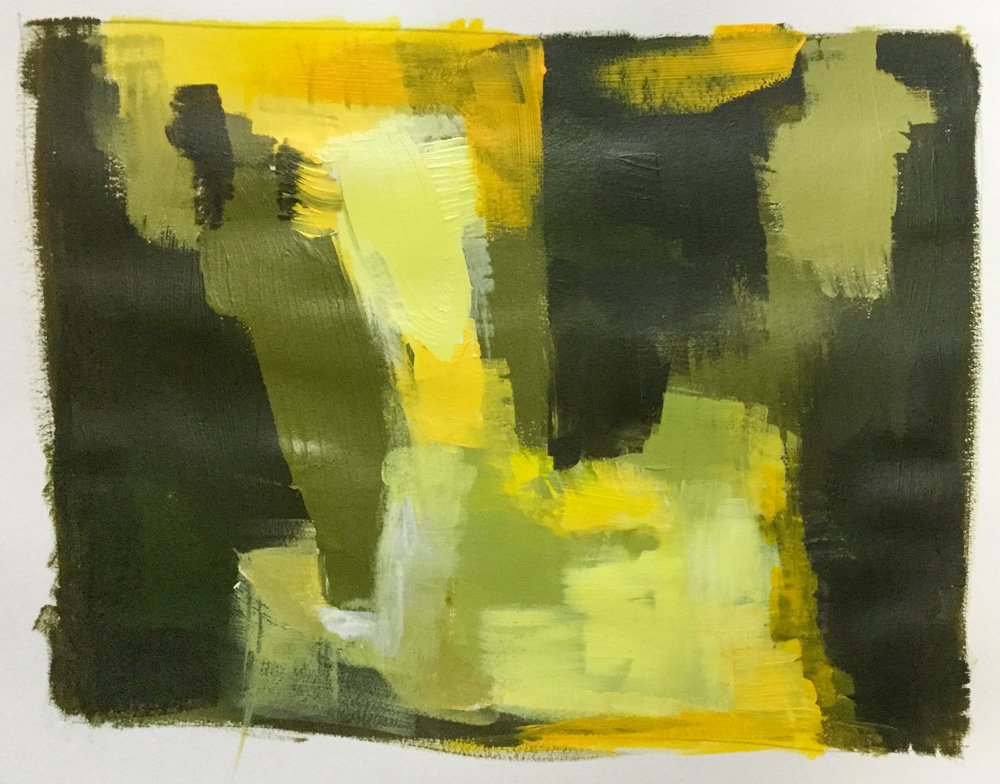
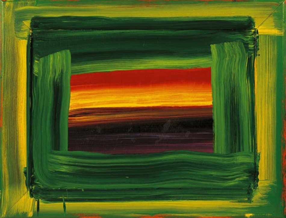
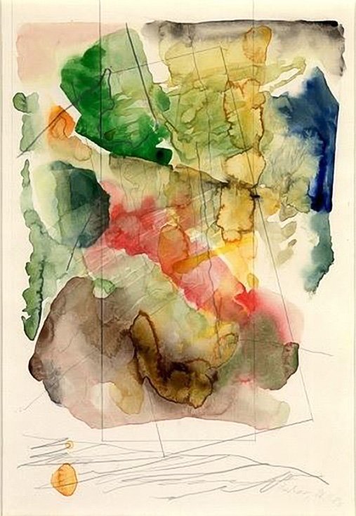
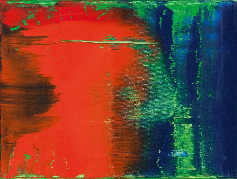
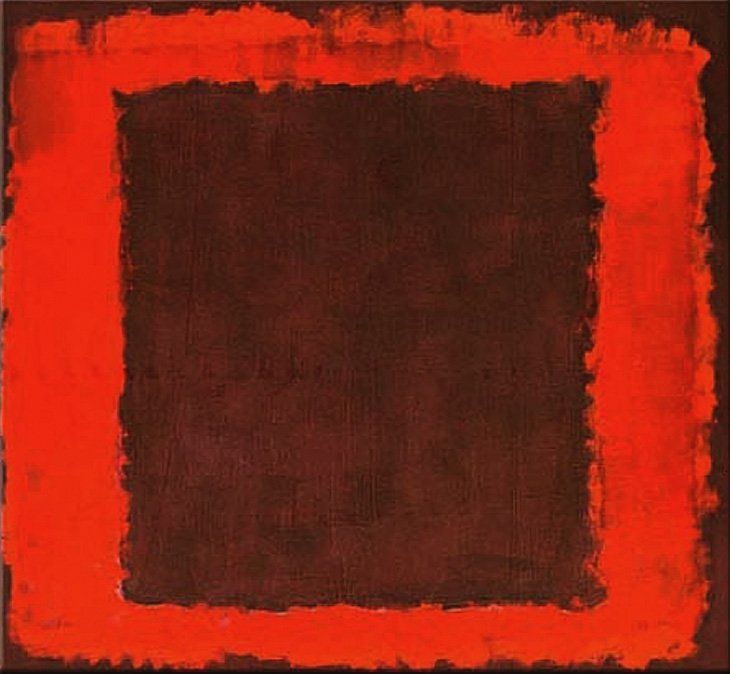
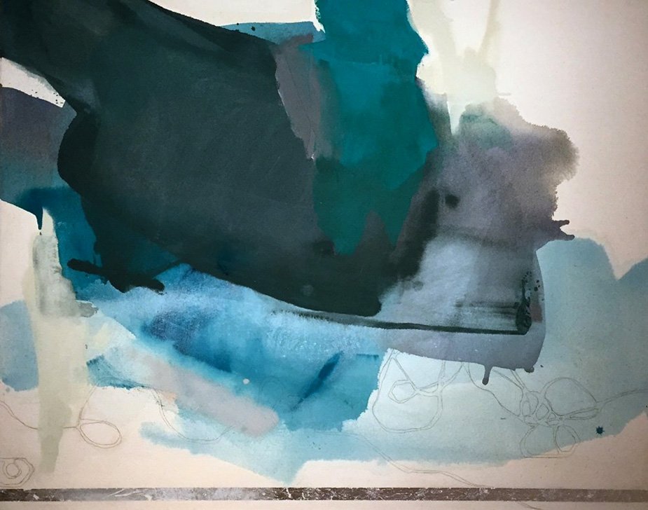
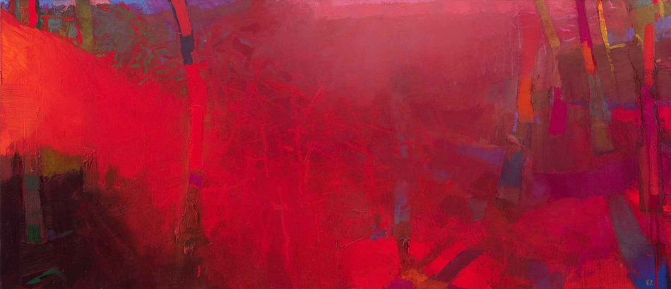
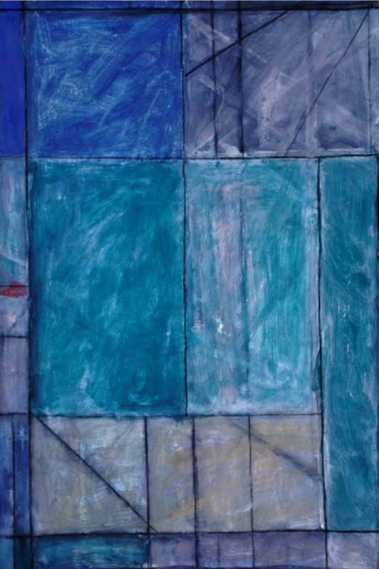
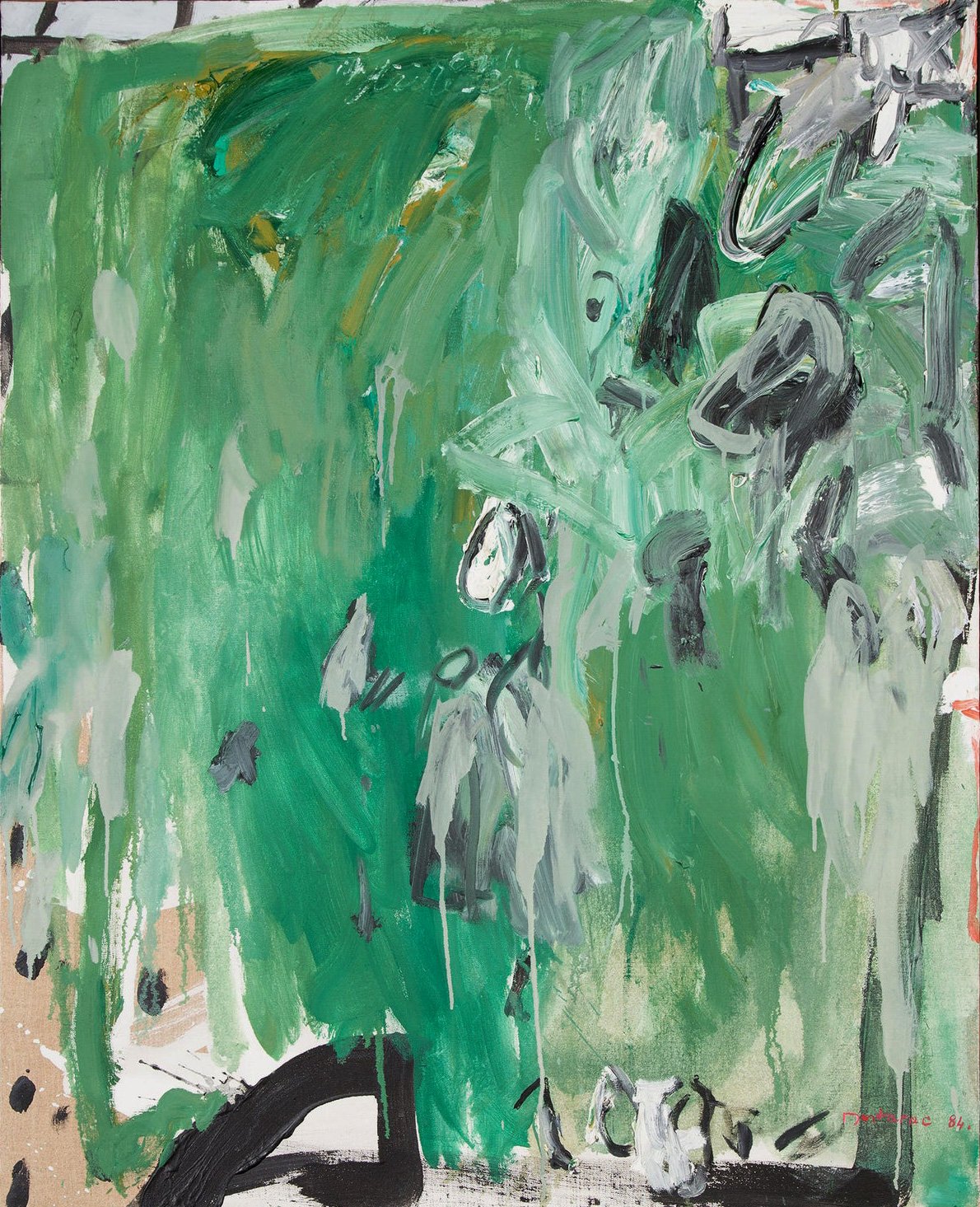
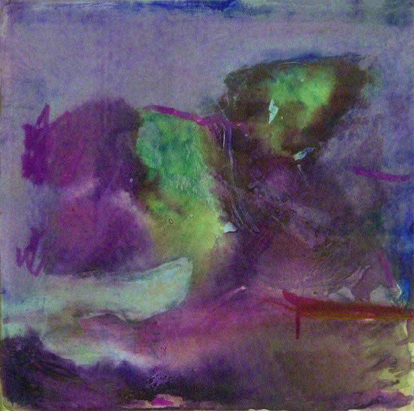
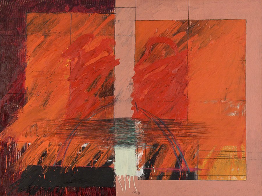
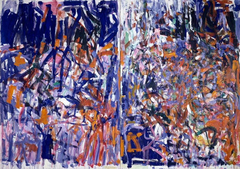
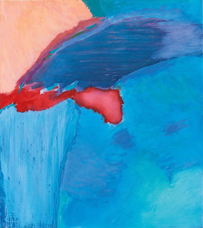
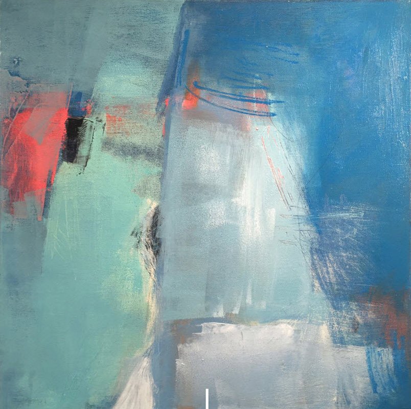
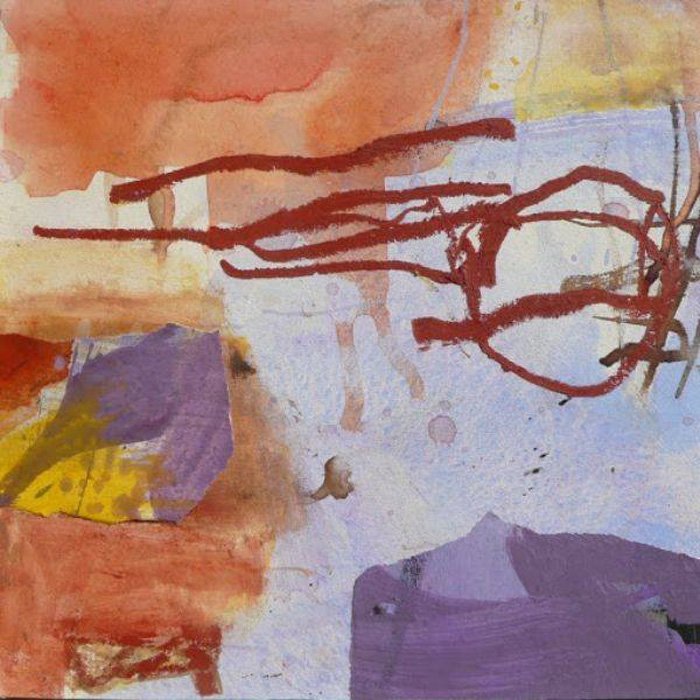
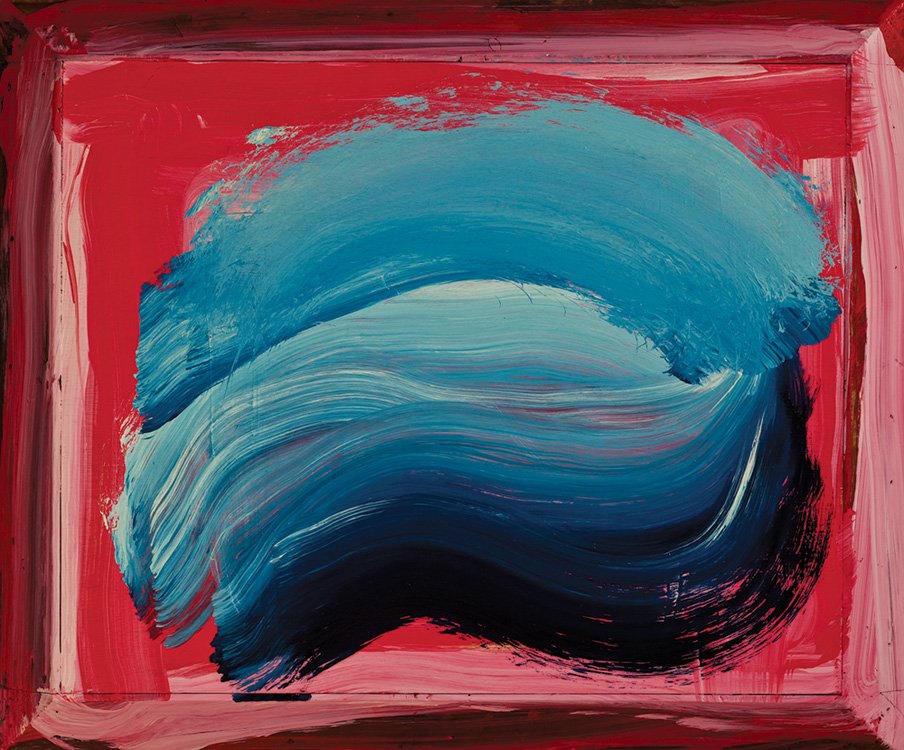
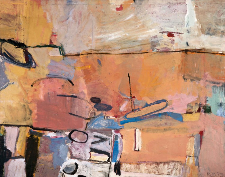
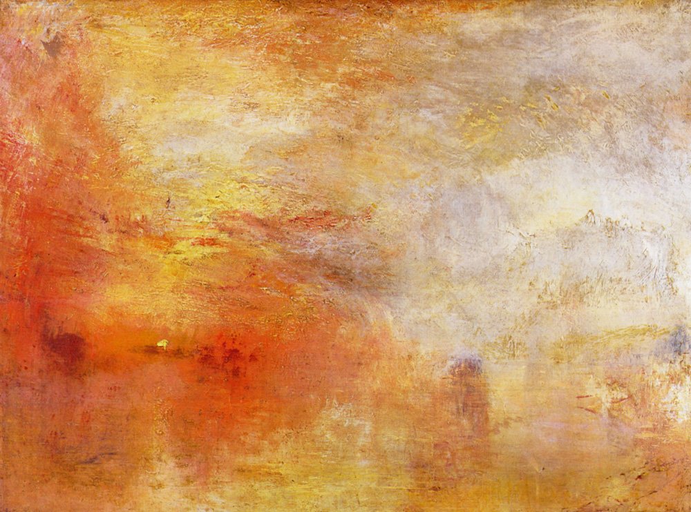
Moods and Atmosphere
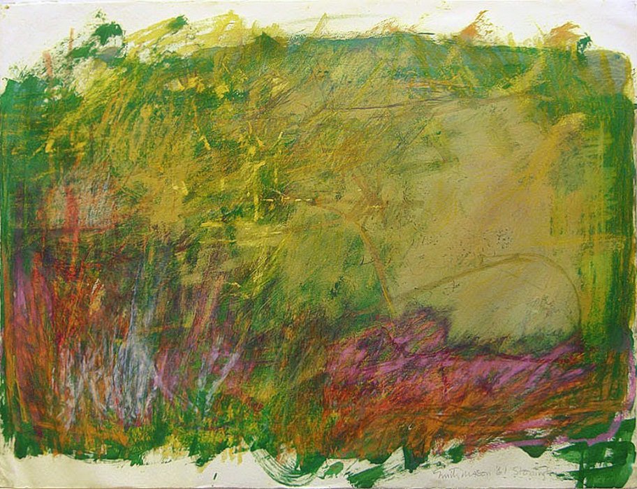
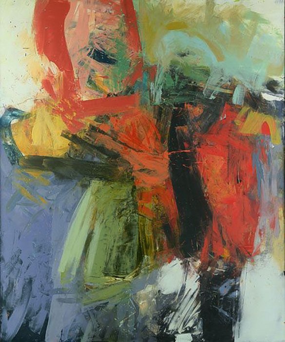
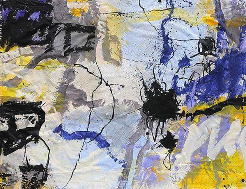
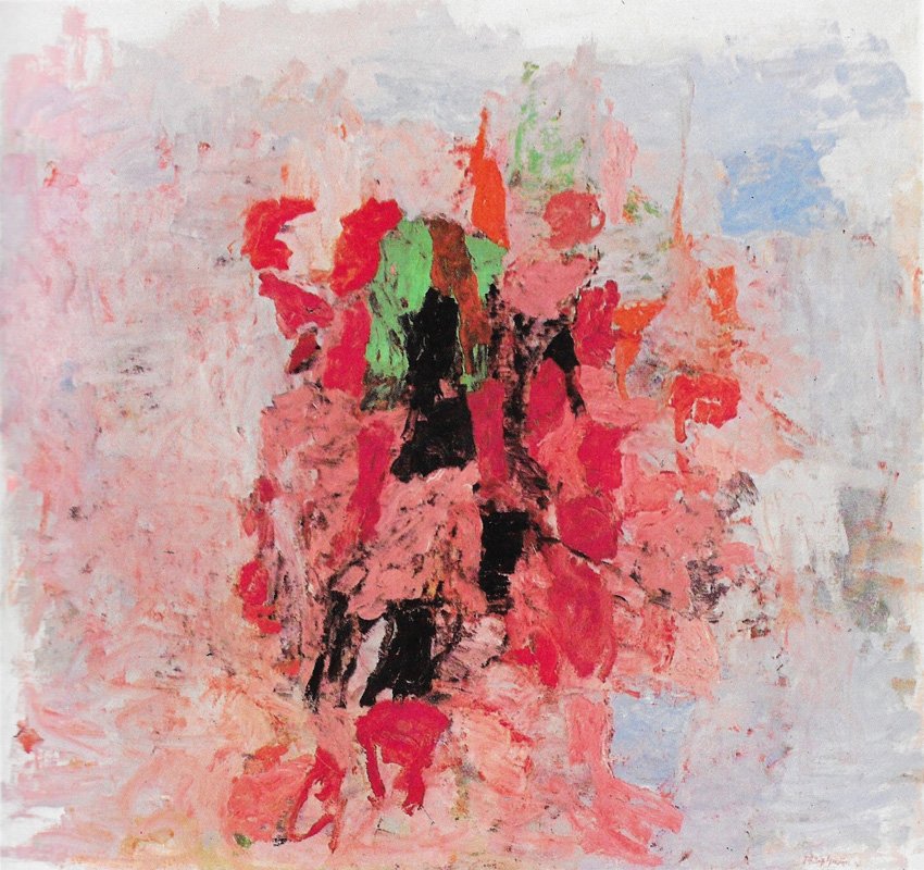
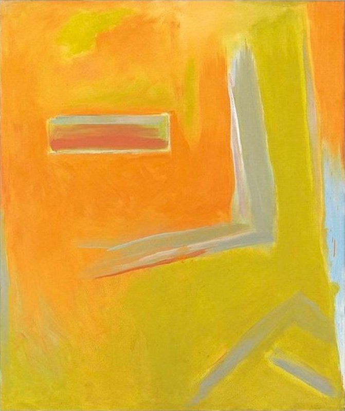
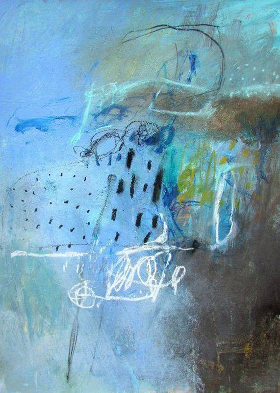
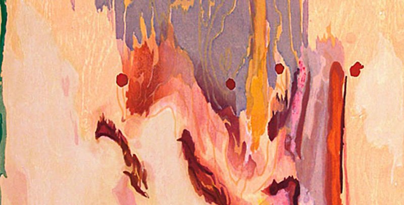
Color and how it is applied set an emotional tone for the whole image. Take a look at some other artists who create moods and atmospheres. What is your experience as you view each piece of art? Can you begin to understand each artist's approach and technique?
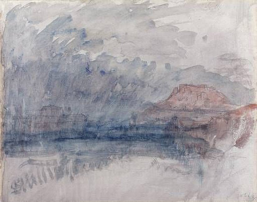
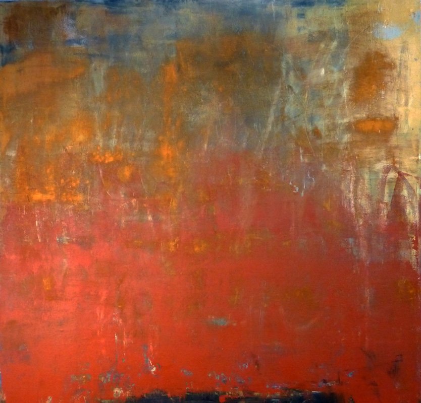
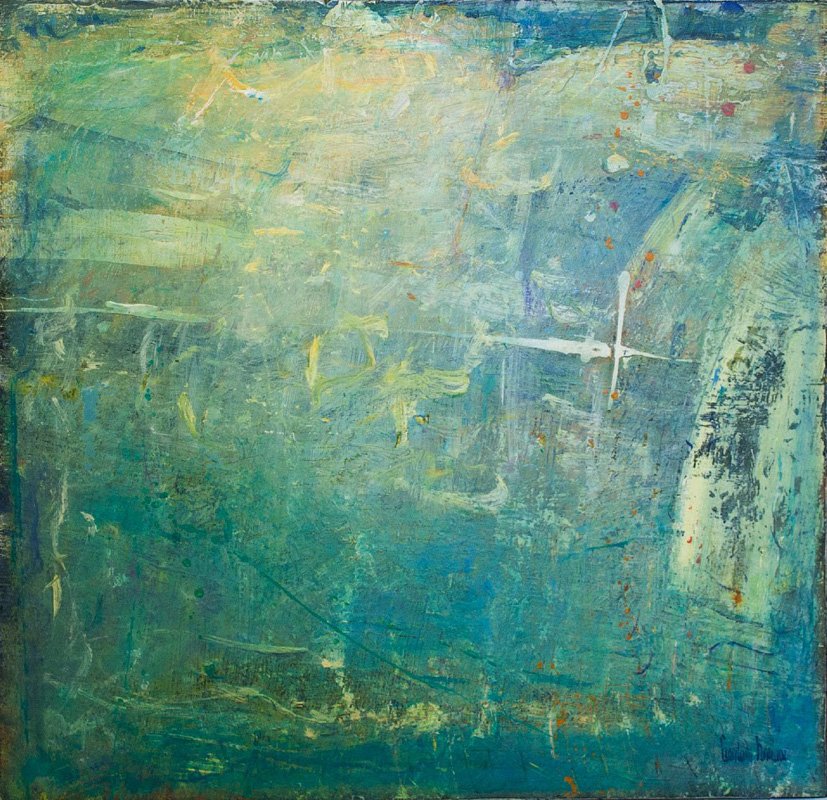
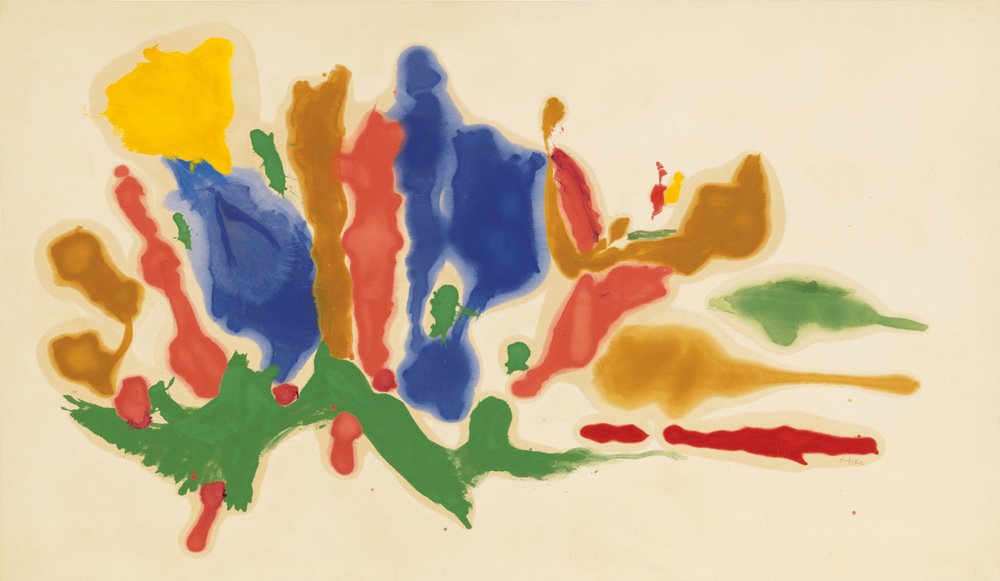
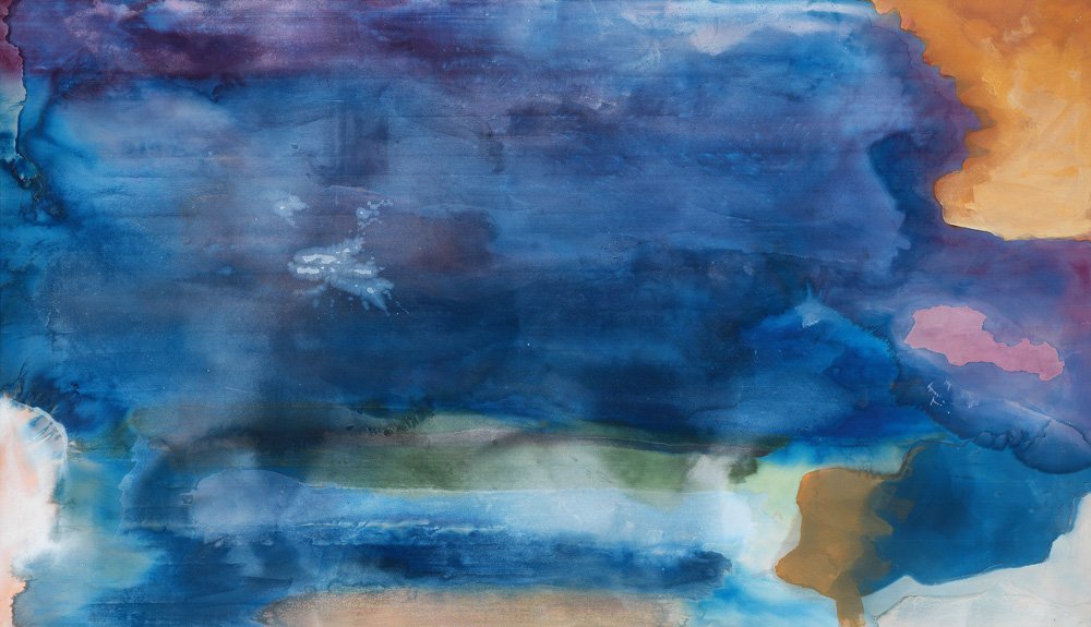
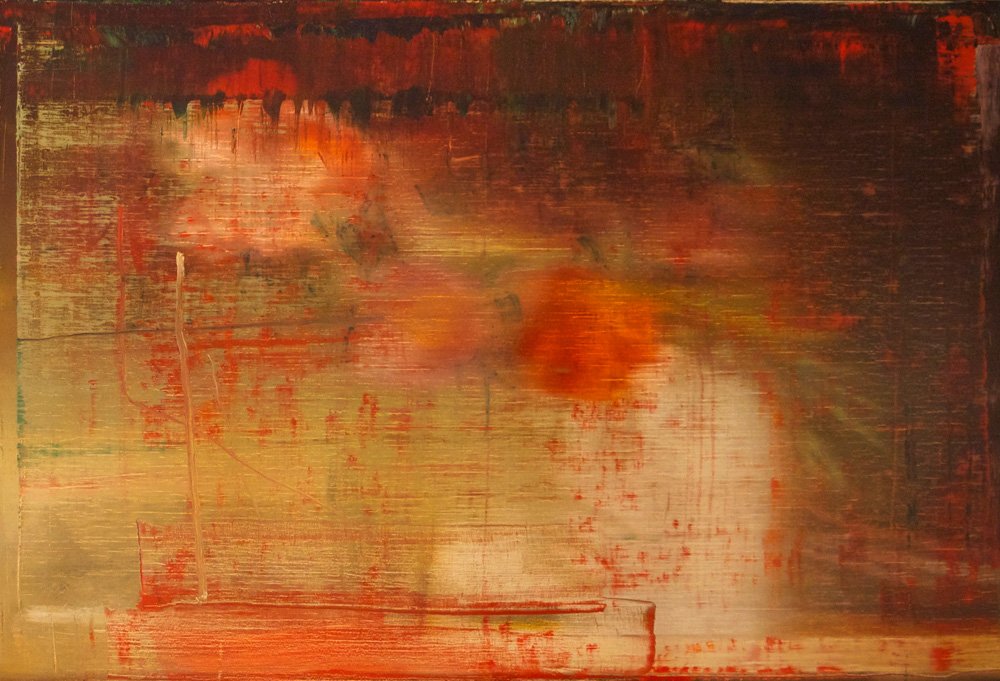
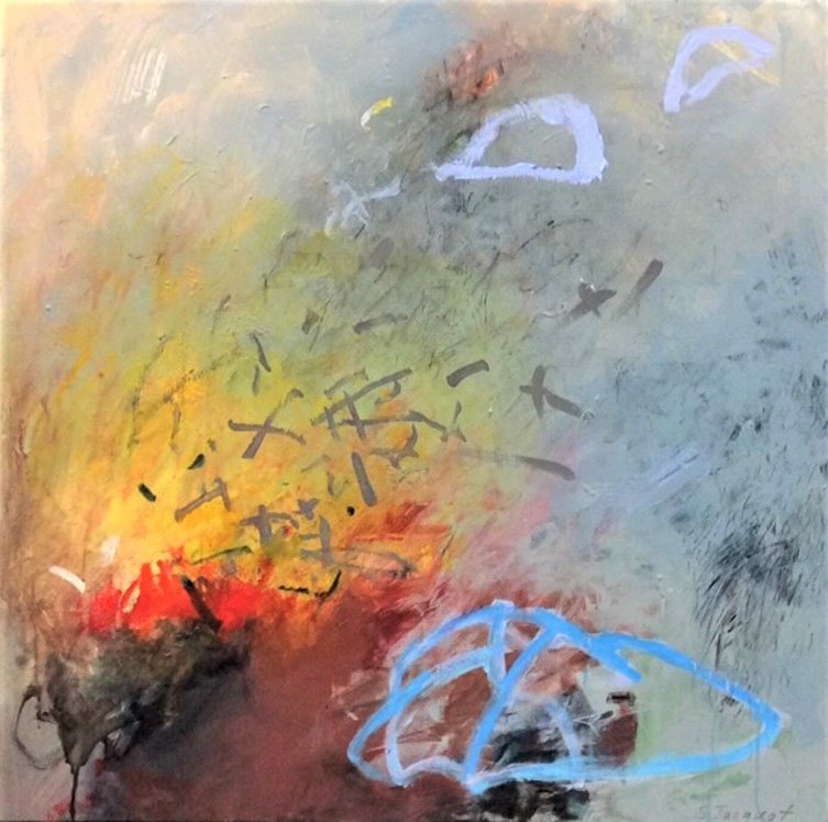
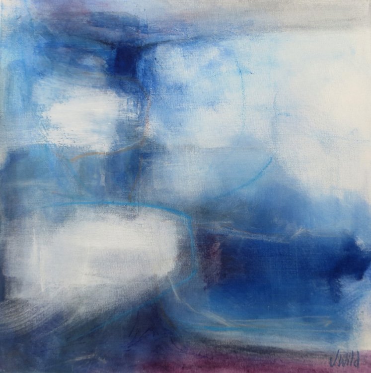
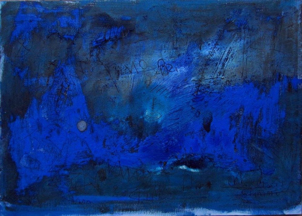
Close your eyes and sense what mood or feelings you are experiencing today. On a larger piece of heavyweight mixed media paper, create an image that reflects a mood or atmosphere that is happening inside you. Share your image with others.
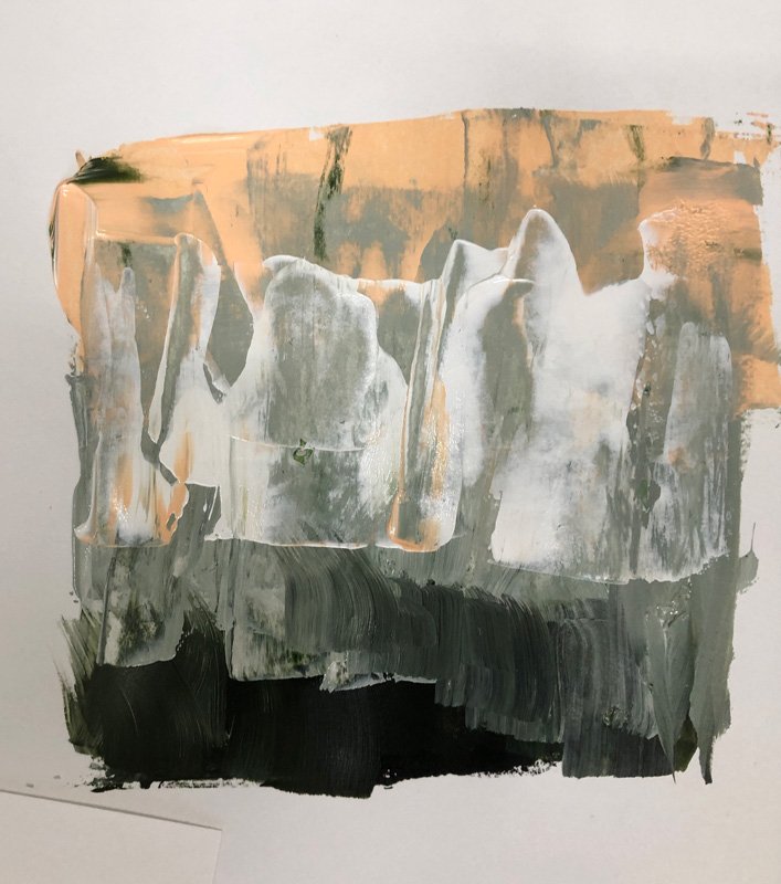
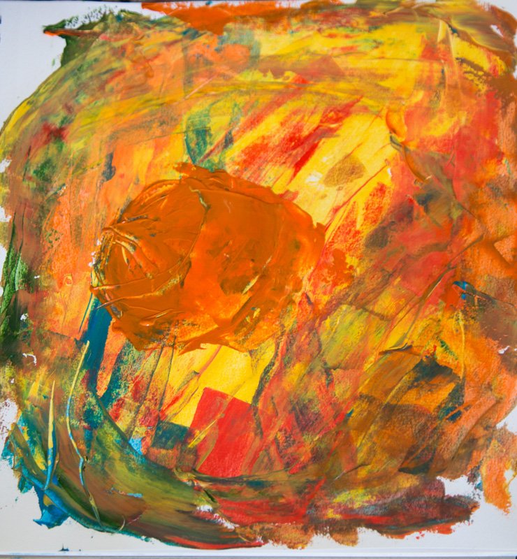
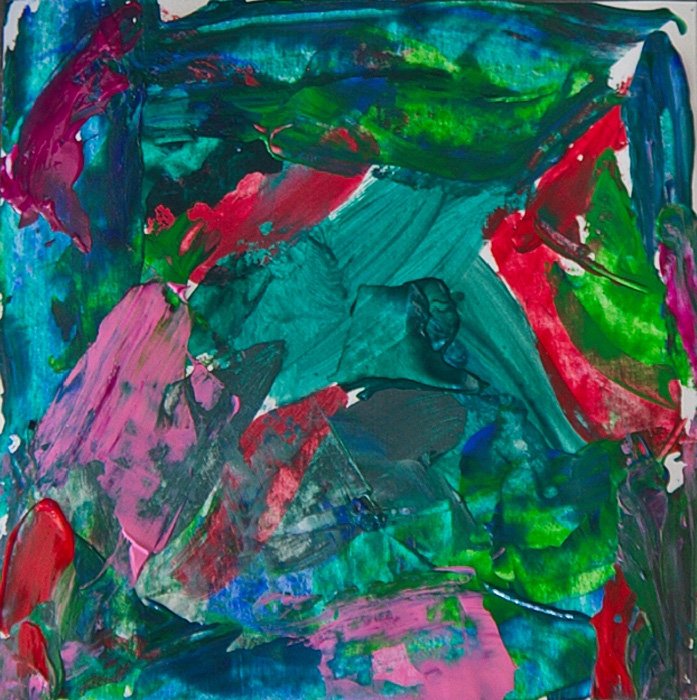
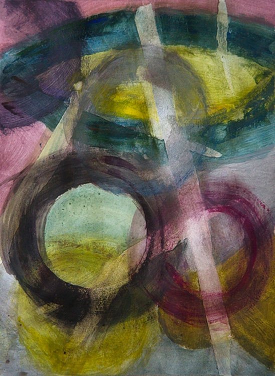
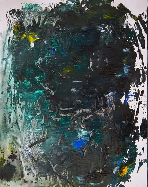
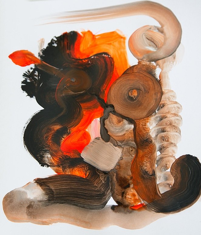
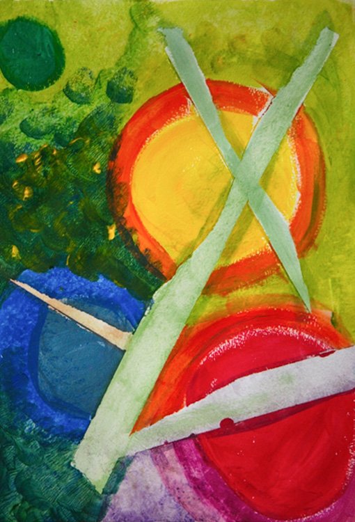
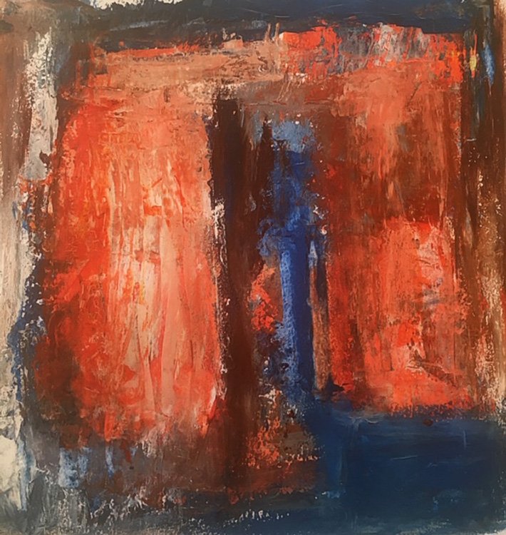
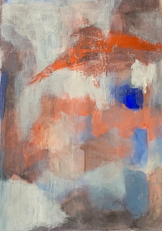
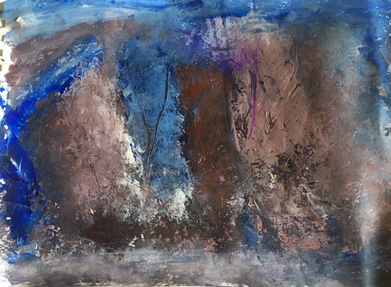
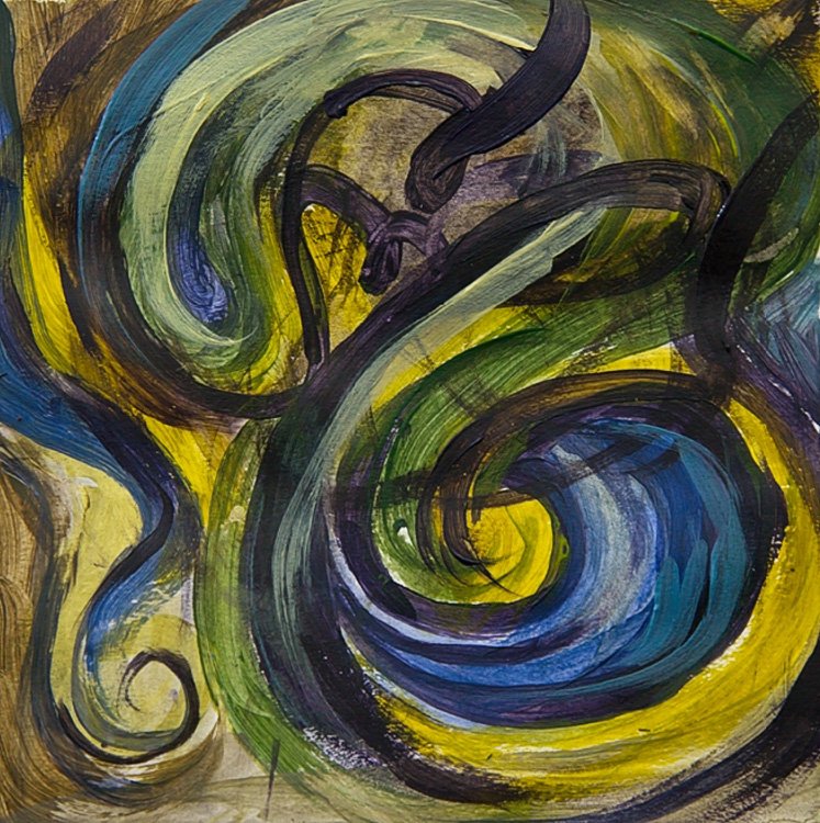
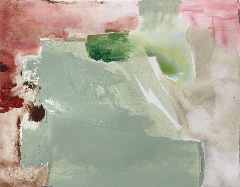
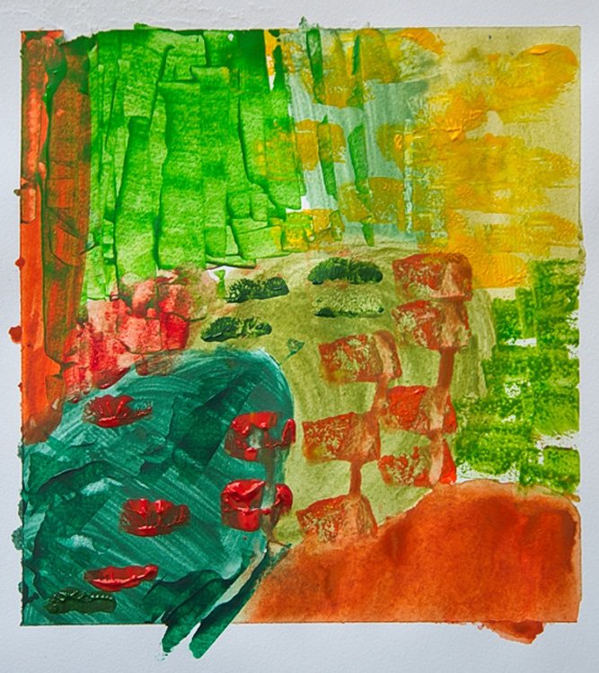
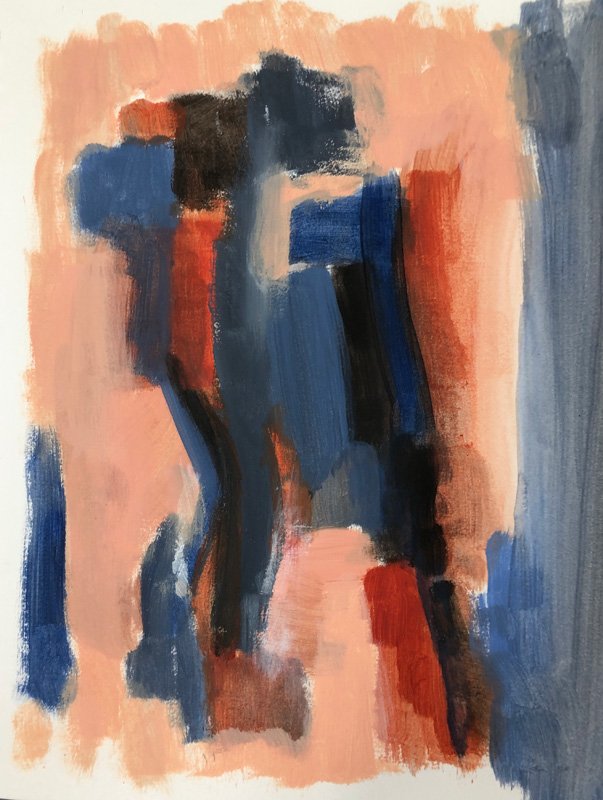
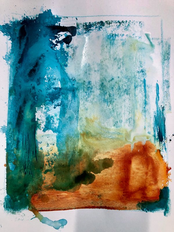
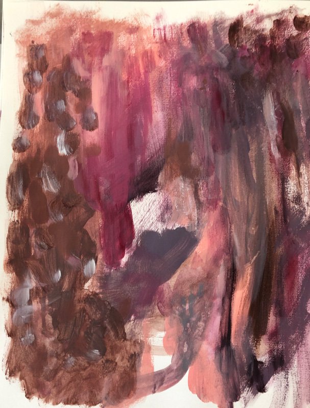
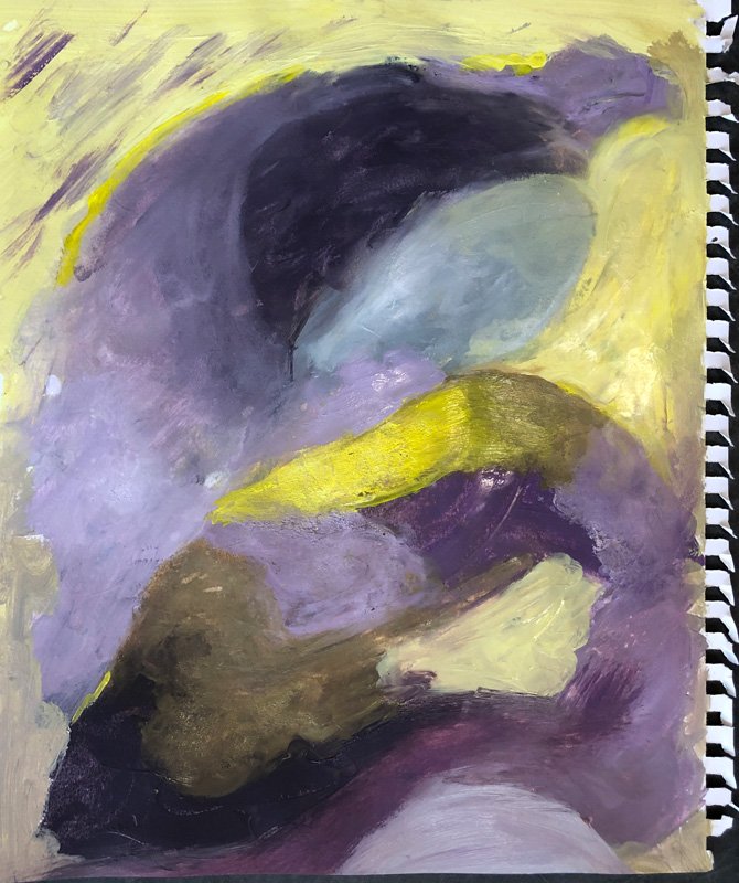
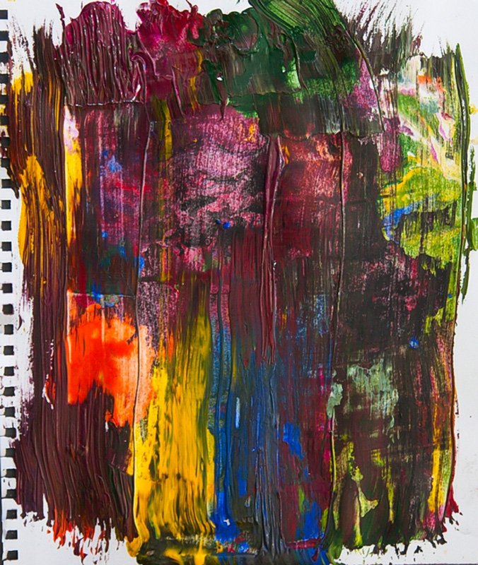
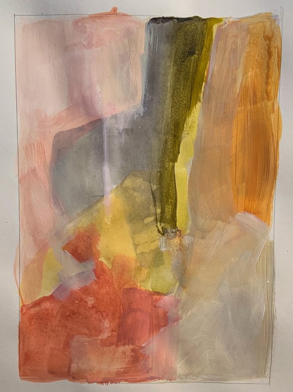
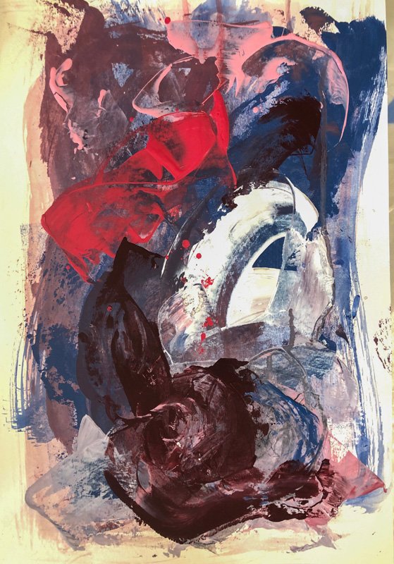
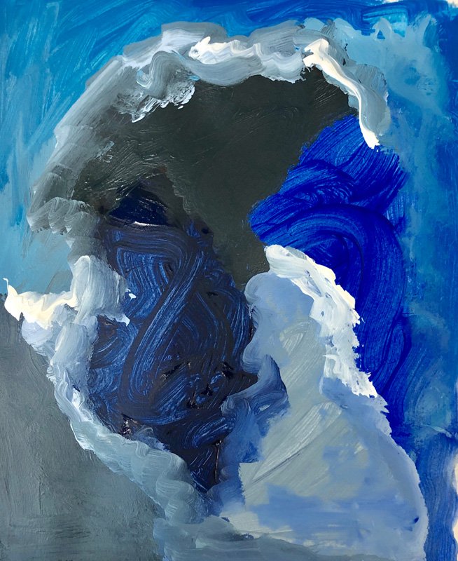
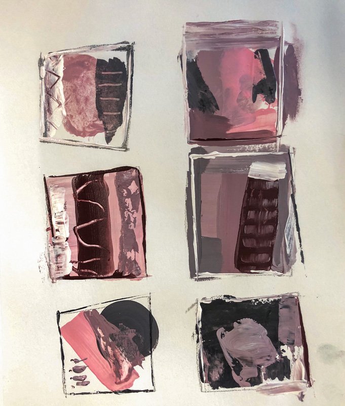
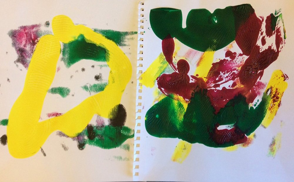
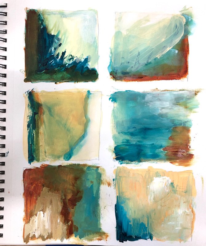
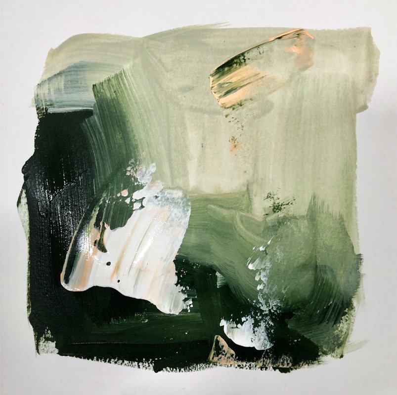
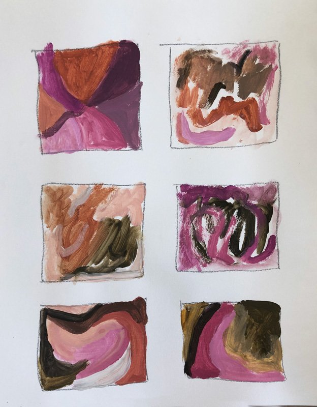
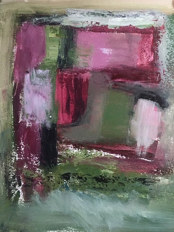
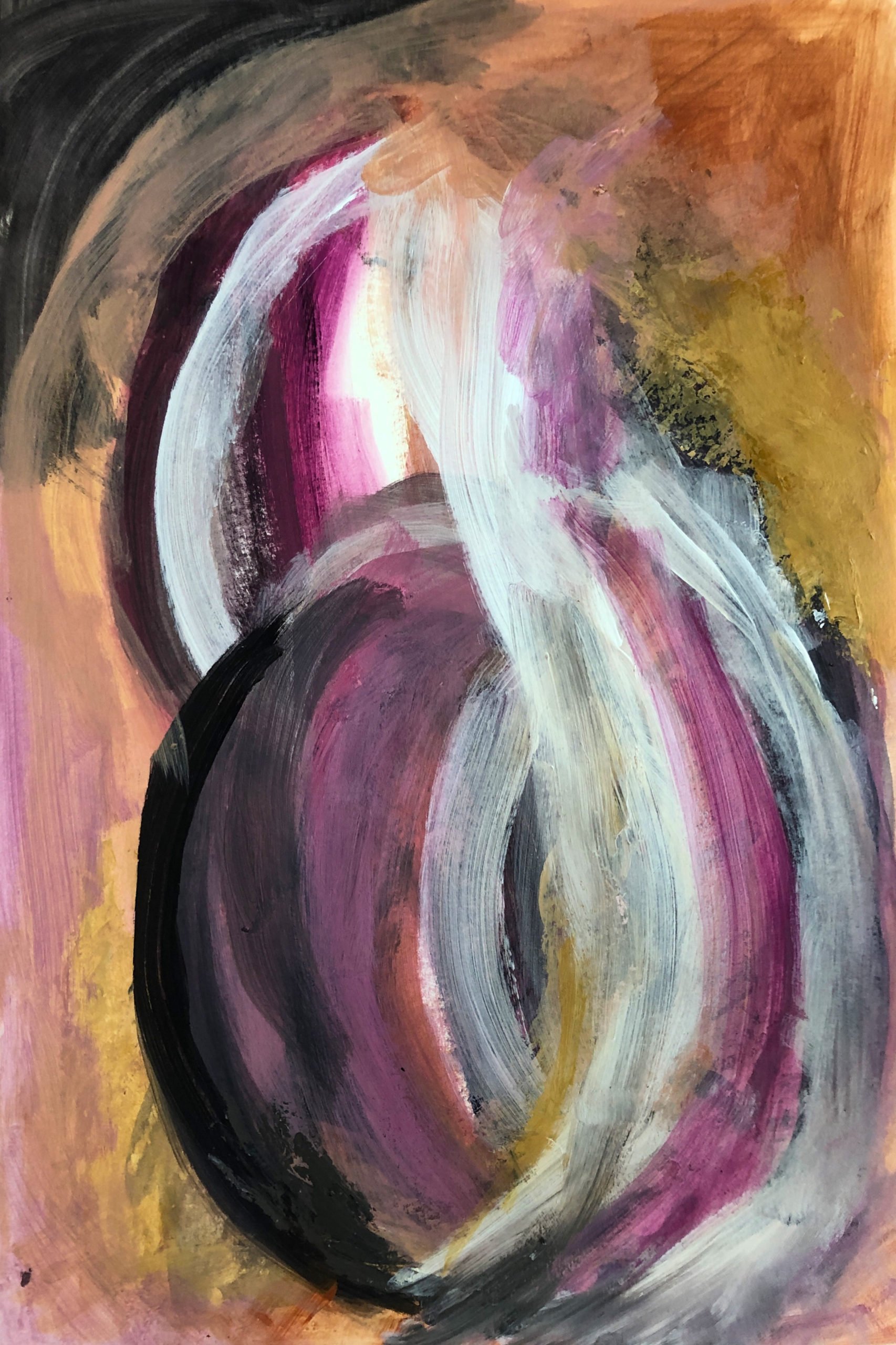
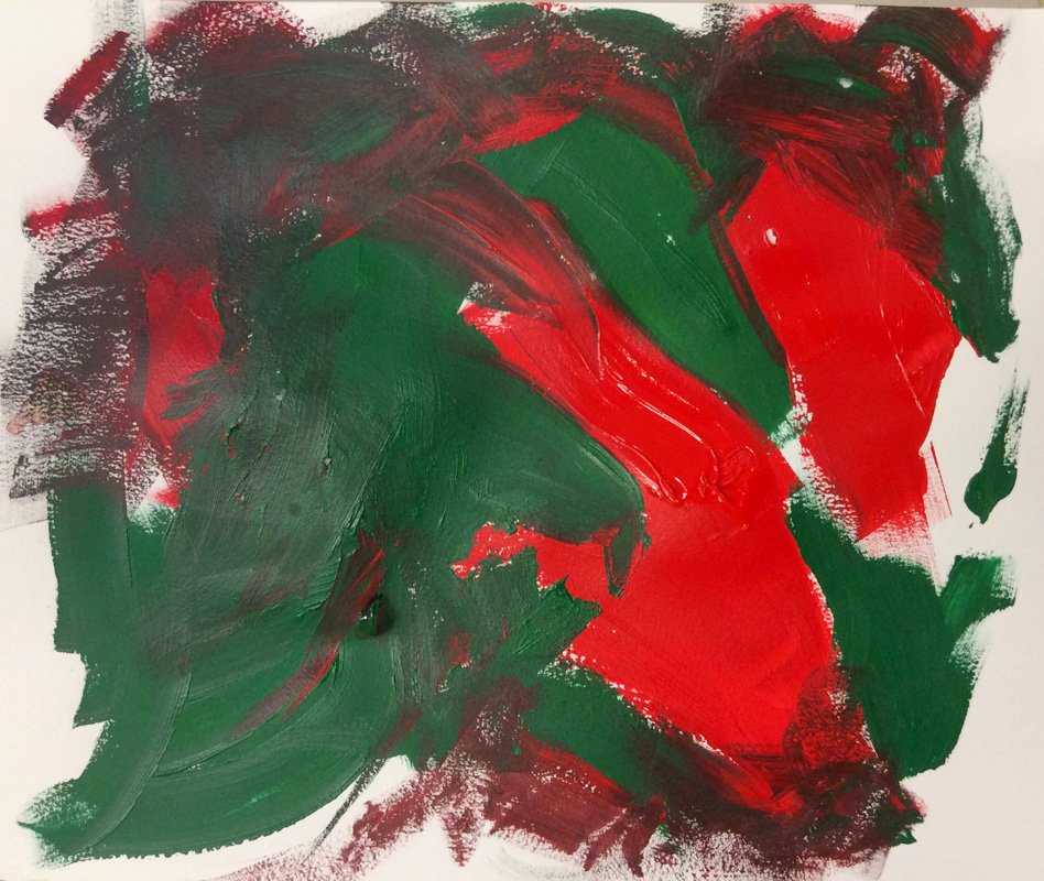
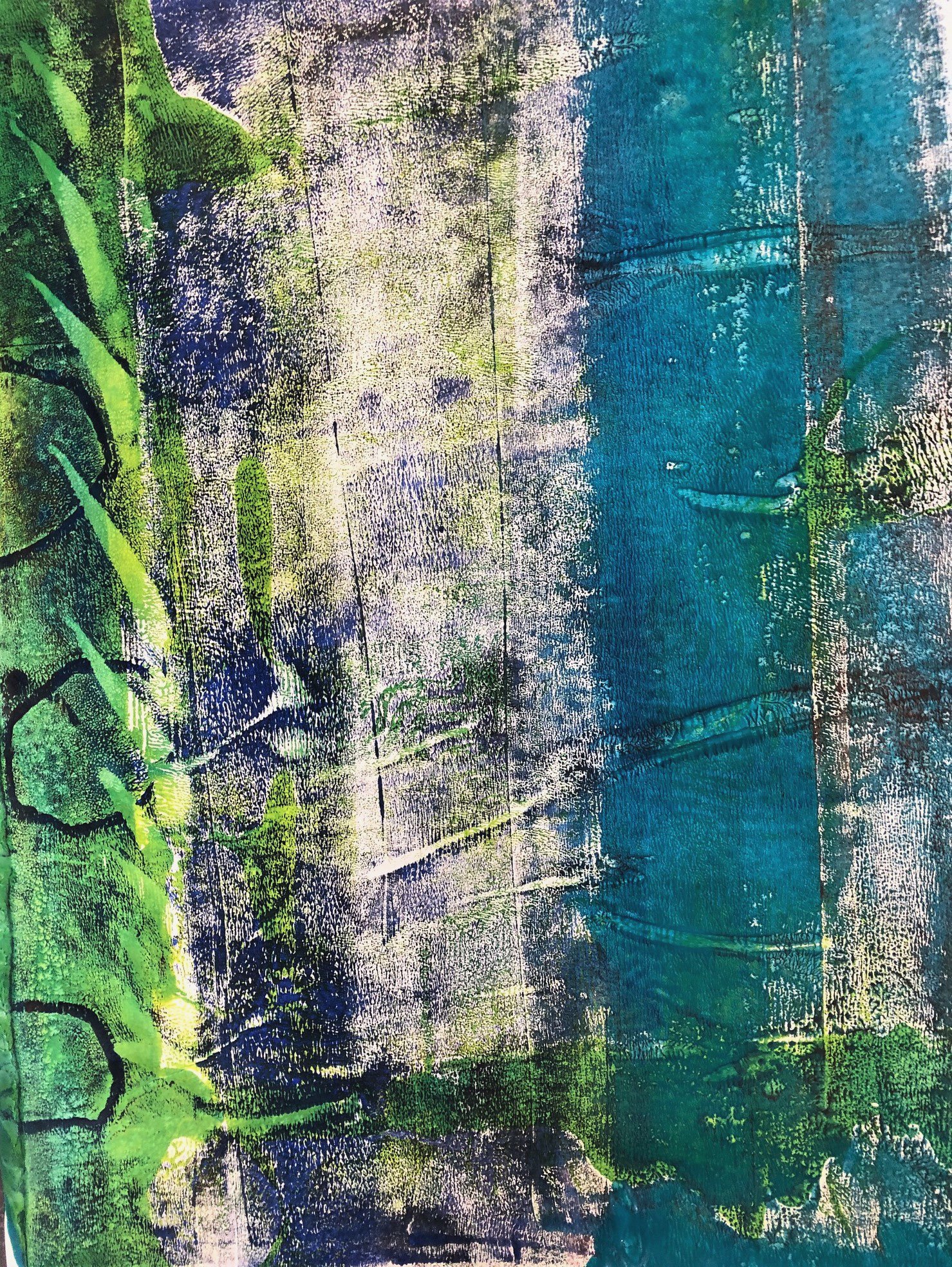
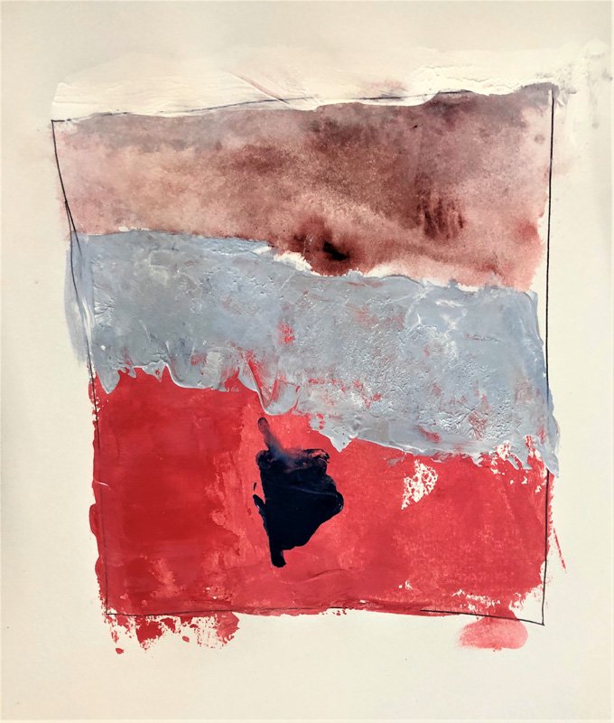
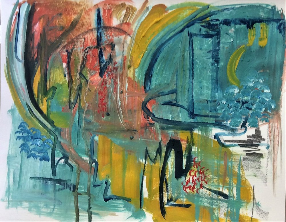
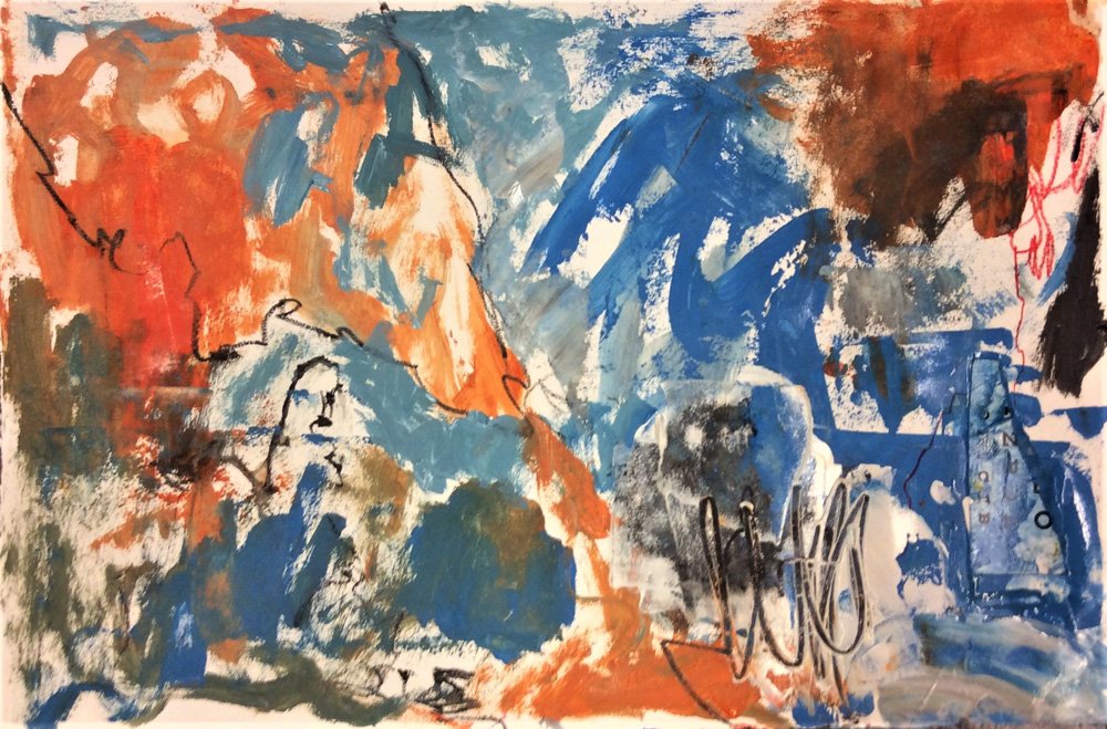
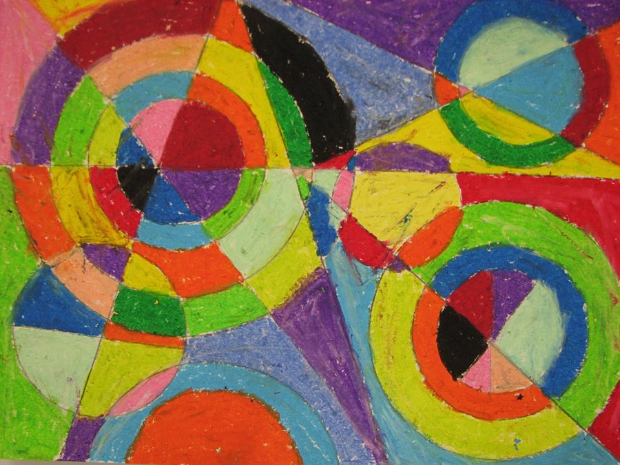
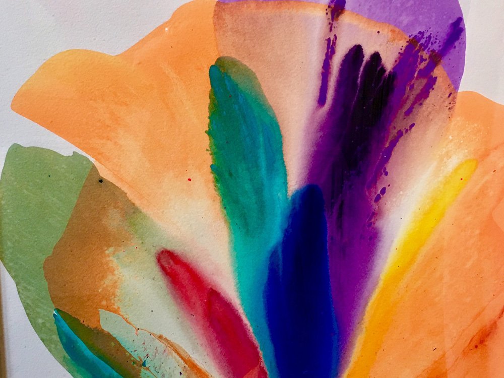
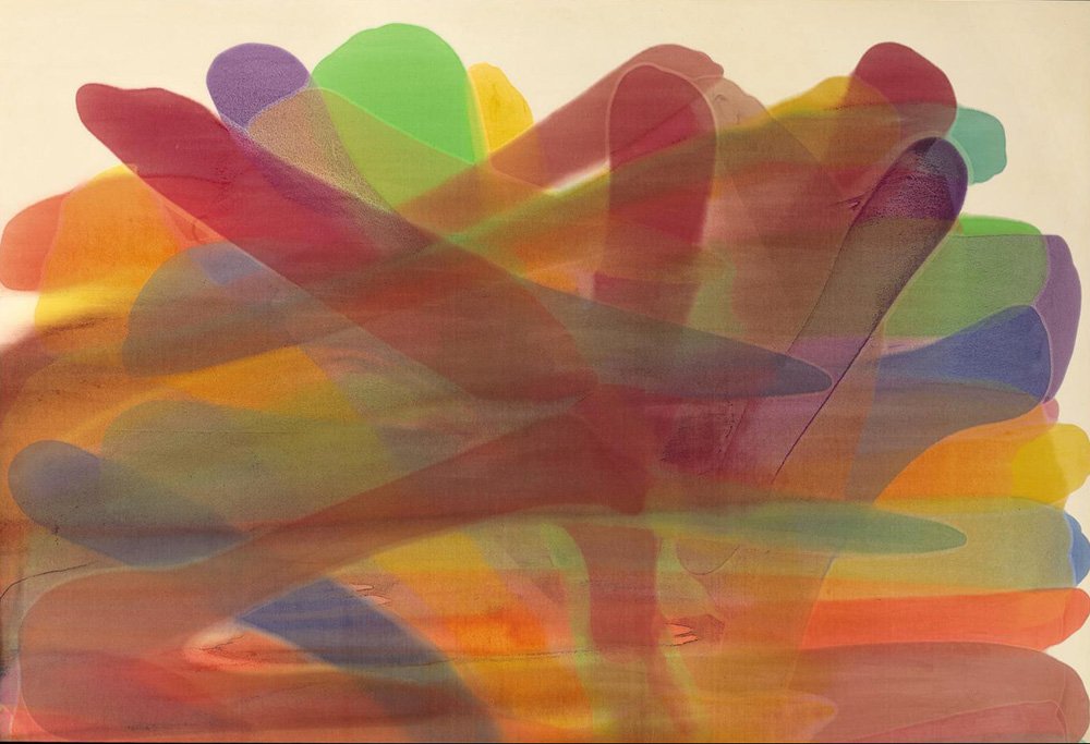
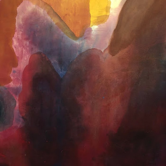
GALLERY
Here are examples of student work from past courses in Color. See if you can pick out which images go with the different exercises for color schemes, moods, and balance. Here is a good place to really look at what the artist was exploring and get a good sense of how color is being used.