4 - Shape and Contrast
MODULE #4
SHAPE & CONTRAST
I found I could say things with color and shapes that I
couldn't say any other way--things I had no words for.
- Georgia O'Keeffe
Introduction
Shape is considered a closed contour or the area confined within a contour line. Shapes can play important roles in the creation of art. They help to create complex drawings and paintings, affect composition, and contribute to the balance within a work.
All shapes will fall into one of two categories-----geometric and organic. Geometric shapes or regular shapes are easy to recognize such as circle, square, rectangle, triangle, trapezoid, etc... These shapes follow mathematical rules.
Organic, freeform or biomorphic shapes are shapes that seem to follow no rules. Organic shapes generally do not have a name associated with them and are typically not man-made and vary greatly from one another.
Shapes defined by objects are positive shapes (space). Shapes defined around or in between objects are negative shapes (space).
The Importance of Contrast
Contrast can be defined as “the difference in visual properties that makes an object distinguishable from other objects and the background.” Or at its most basic level as “things which look different from one another.”
Contrast refers to differences in values, colors, textures, shapes, and other elements. It is an important understanding for making dynamic paintings. In this Module, we will be focusing on differences in shape. We encourage each participant to think of contrast when learning and using each of the elements of art.
The primary "forms" of contrast include size, position, color, weight, texture, shape, and orientation. Some examples are small and large, next to and far away, light and dark, rough and smooth, thick and thin, rounded and angular, busy and quiet, etc.
Contrasts create visual excitement and add interest to the work. Contrast helps lead the viewer’s eye into and through the painting, and contrast establishes hierarchies and define relationships in order to convey an idea or experience.
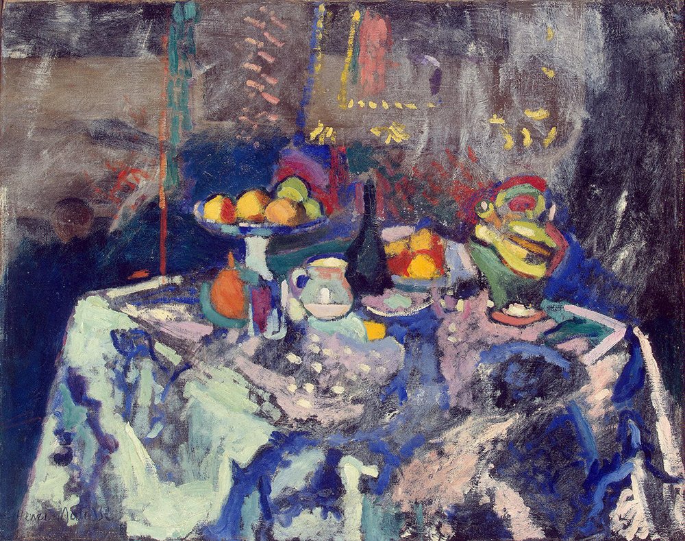
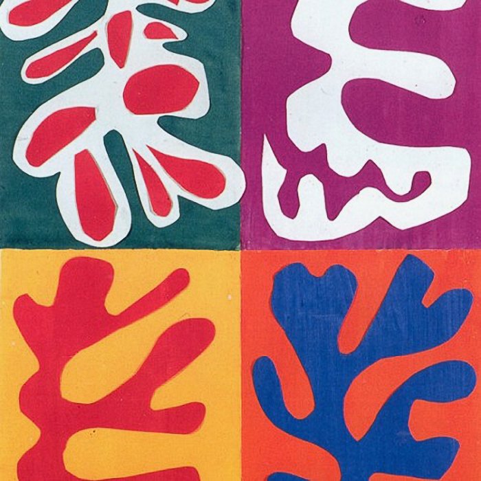
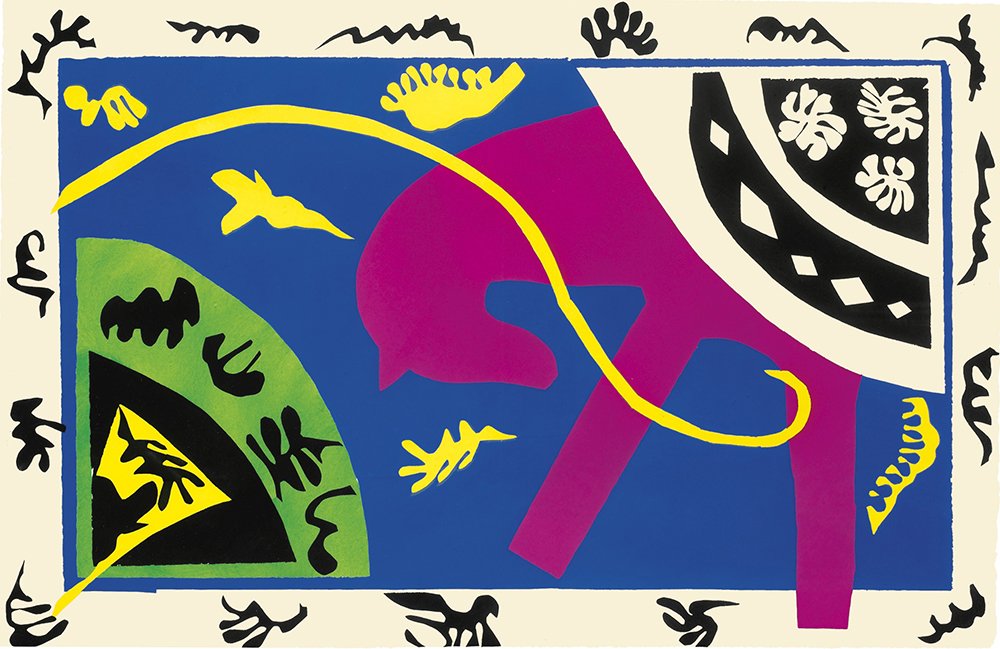
Shape and Contrast Slideshow
MATERIALS FOR SHAPE AND CONTRAST EXERCISES:
Mixed media workbook 9” X 12” or 11” x 14”
Scissors
Straight edge/ruler, matt knife/paper cutter
Pencil
Charcoal
Eraser
Fixative
Glue stick
Black paper
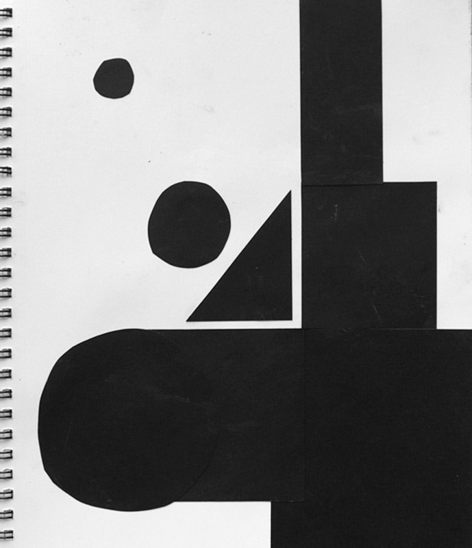
EXERCISE #1
Creating with Geometric Shapes
Using the black paper cut out geometric shapes of all varieties and sizes (squares, rectangles, triangles, circles, etc.). These should be fairly accurate so using a paper cutter in the quickest and easiest way to do this. Otherwise, use your ruler and mark out shapes in pencil on the black paper. Use scissors or a mat knife to make clear accurate cuts.
On the clean white surface of a page in your mixed media workbook, place various shapes and move them around to gain the most pleasing placement. You can use as little as 3 shapes but use contrasting sizes and shapes to get a more dynamic effect. As you move the shapes around, notice how the eye can flow around the shapes or not and notice the relationships you are creating between shapes and the paper. Work quickly and intuitively. Once you find placements you like, glue them down.
Repeat this process two or three times.
Review your results and out loud say what you like about each group of shapes. Also say what is not so resonating to you on how you placed them. Look for focus, eye flow, relationships and contrast.
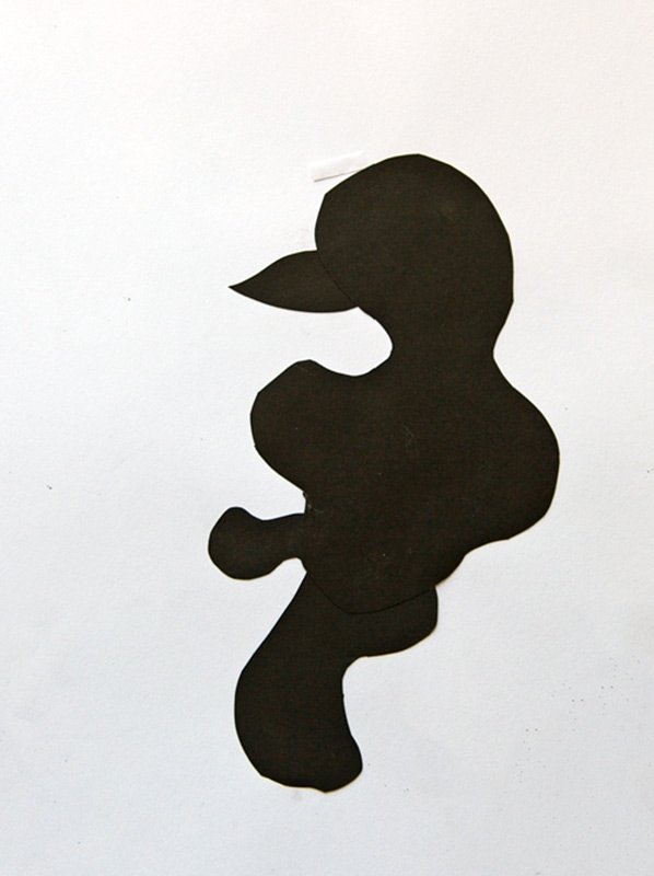
EXERCISE #2
Creating with Biomorphic Shapes
This exercise is the same as No 1 but this time we will be using Biomorphic Shapes. Biomorphic shapes are shapes that are irregular and curvilinear. Again, cut them out of black paper, makes all varieties of sizes and contours.
In your Multimedia Workbook create three different pages of compositions using only the curvilinear shapes, working fast and intuitively. Once you find the relationships that you like, glue them down. As a reminder, shapes can go off the page and be trimmed later.
Again, review what you like and what doesn’t resonate with you.
EXERCISE #3
Combination of Geometric and Curvilinear Shapes
In this exercise, we will repeat the same process as a Exercise #1 and #2 but using both kinds of forms, mixing sizes, shapes on the same page. Use as few or as many as you wish, working fast and intuitively and considering the contrast of form, placement relationships and eye flow. Try to surprise yourself in arranging them on the page. It is okay to let them go off the page. They can be trimmed later.
Do the same review as above.
Did you notice that you increased the complexity and hopefully the excitement of the image by combining both curvilinear shapes and geometric shapes and the various sizes as well. It is important to notice when complexity becomes chaos and when it is actually enlivening the image.
Again, review what you like and what doesn’t resonate with you.
EXERCISE #4
Torn Shapes
In this last exercise of the series we use both biomorphic cut shapes, hard edged geometric shapes and now we will add “torn” or roughed edged biomorphic (and geometric) shapes as another level of contrast. Tear black paper into various shapes and sizes both biomorphic and geometric.
Using a combination of the shapes create 3 distinct images by moving the shapes around on the paper in your mixed media book, quickly and intuitively as above. When satisfied, glue down.
Repeat the review above.
EXERCISE #5
Creating Contrast with Shapes
This is a great exercise to hone your ability to think in contrasts. In your workbook, using all kinds of tools and drawing implements and with no more than 2 colors and black and white, create shapes that show as many variations as you can dream up. Some hints would be to make shapes that have contrasts in size, shape, weight, hue, texture, placement, value, to name a few. Have fun and make an interesting composition too!
EXERCISE #6
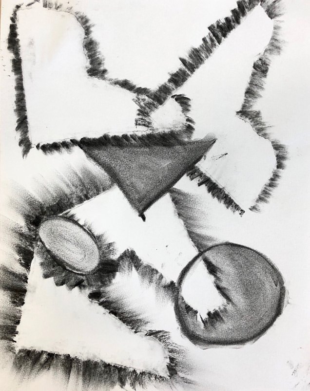
Edges of shapes / negative and positive spaces / and creating layers
Choose a few of the black shapes from the previous exercises (#1-4). In your workbook place one of the shapes down on the paper and rub charcoal around the edge of the shape. You will notice that you have created a negative space of that shape. Do this with 2 or more shapes overlapping them as you wish being mindful of the eye flow and relationships you are creating. Again, work quickly and intuitively.
Use your fingers to smear and blend the edges. By doing this you can actually cause the edges to disappear. Use an eraser to lighten or obliterate the edges. Notice that you begin to create layers of different intensities and even though some of the edges are blurred or obliterated, the shape is implied. You can also add a positive shape by tracing around a shape and then filling it in. Continue experimenting with the shapes overlapping and going seemingly “in front of” or “behind others”.
After you are satisfied with your image, we suggest you review what you learned, what you liked, and what you didn’t like in this exercise so that you may make use of the information and technique in your personal work. Spray your image with fixative to preserve it from further smearing...
BONUS
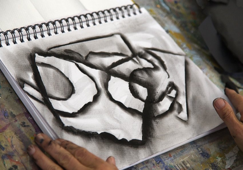
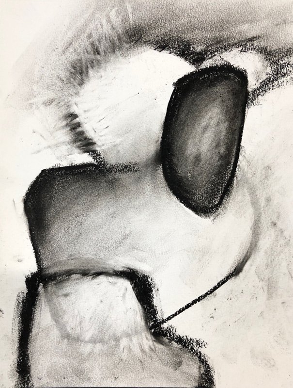
Creating a Painting Using Contours of Shapes
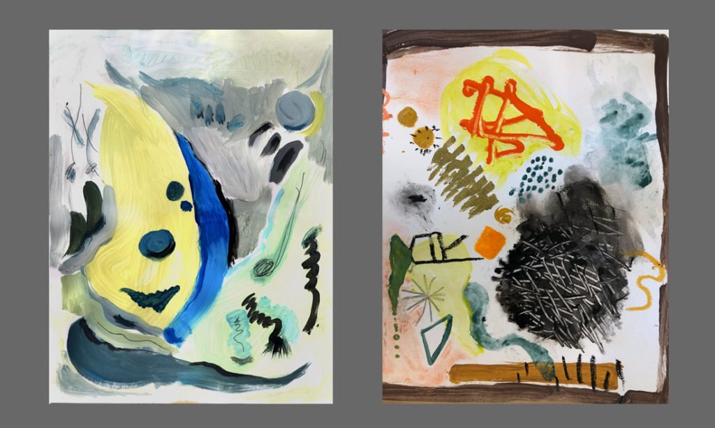
In this first Bonus video, we show how to start an image using contours of shapes with graphite and charcoal. Watch how the painting develops as Suzanne demonstrates working with contours, erasure, and building layers leaving some history of the lines drawn and then more of the same added to give depth. She continues until a dialogue between her and the paint takes over leading the painting into a direction of its choosing, Notice how coming in with white solid paint marker adds another layer and more depth. This way of working gives a build up of marks, shapes, and paint for a rich images.
TO DO
22" x 15" paper or larger.
Graphite, charcoal, black paint
eraser, sponge, rag or paper towels
black and white paint and one or two colors
paint brushes
matt medium
Make a painting using contours of shapes and various methods to develop layers and depth. Be mindful of eye flow and composition as you do this.
The art of blending
In the following video Grant demonstrates how to work with shapes and the art of using blending to give more interest to the shape. He also highlights the edges of a shape by giving color to the background for emphasis. Notice how blending can bring two shapes together and provide more unity.
TO DO
22" x 15" paper or larger.
Graphite, charcoal, black paint
eraser, sponge, rag or paper towels
black and white paint and one or two colors
paint brushes
matt medium
Make a painting using contours of shapes and various methods to develop layers and depth. Be mindful of eye flow and composition as you do this.
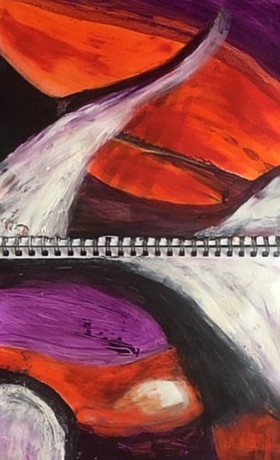
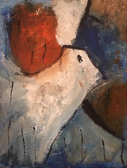
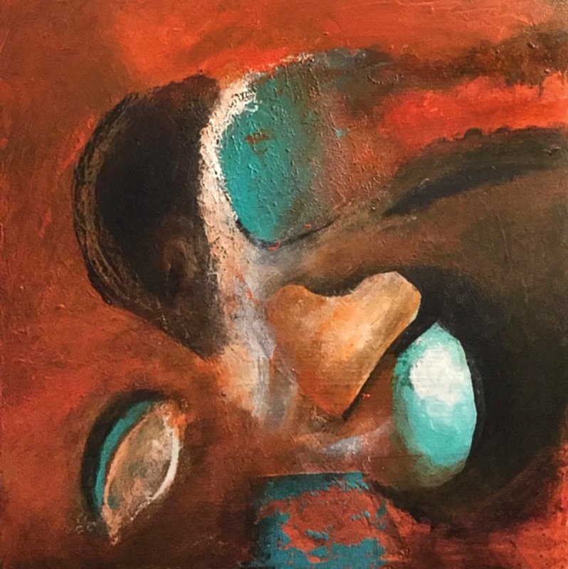
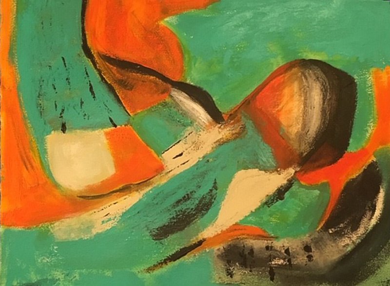
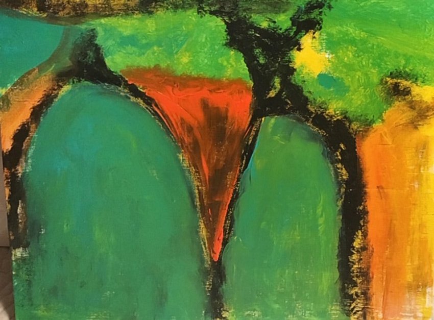
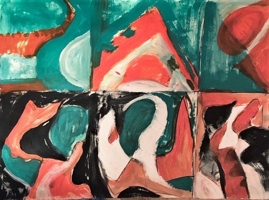
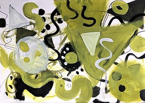
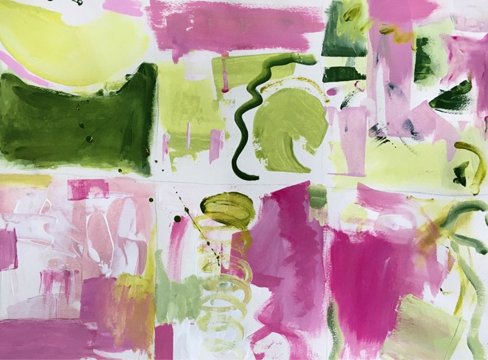
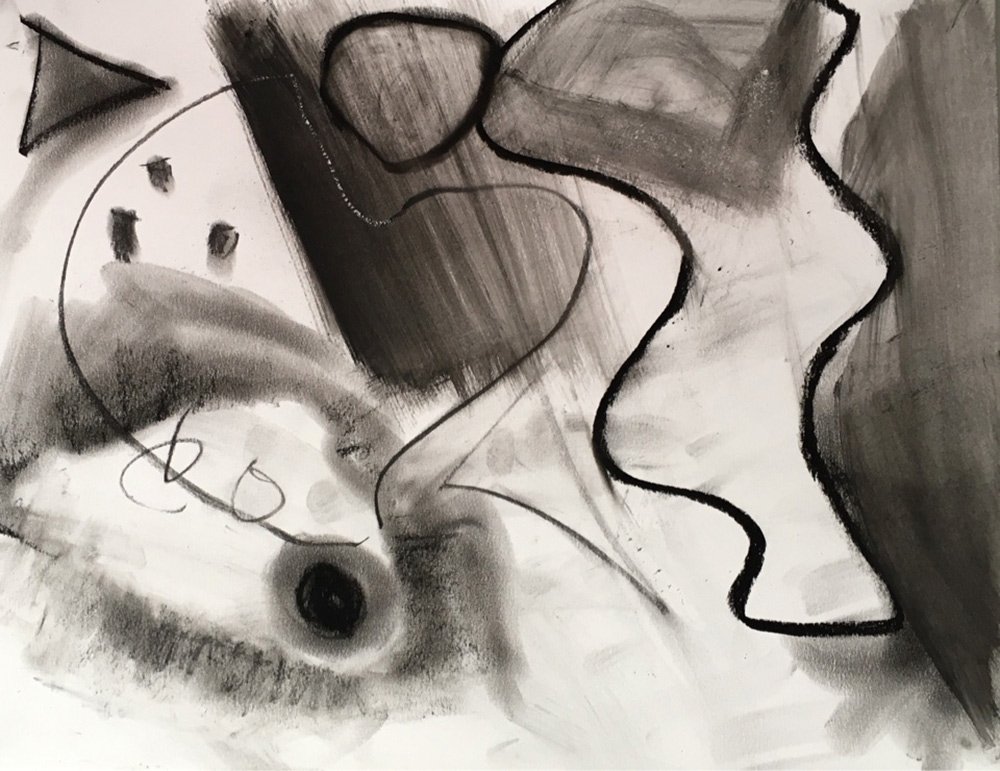
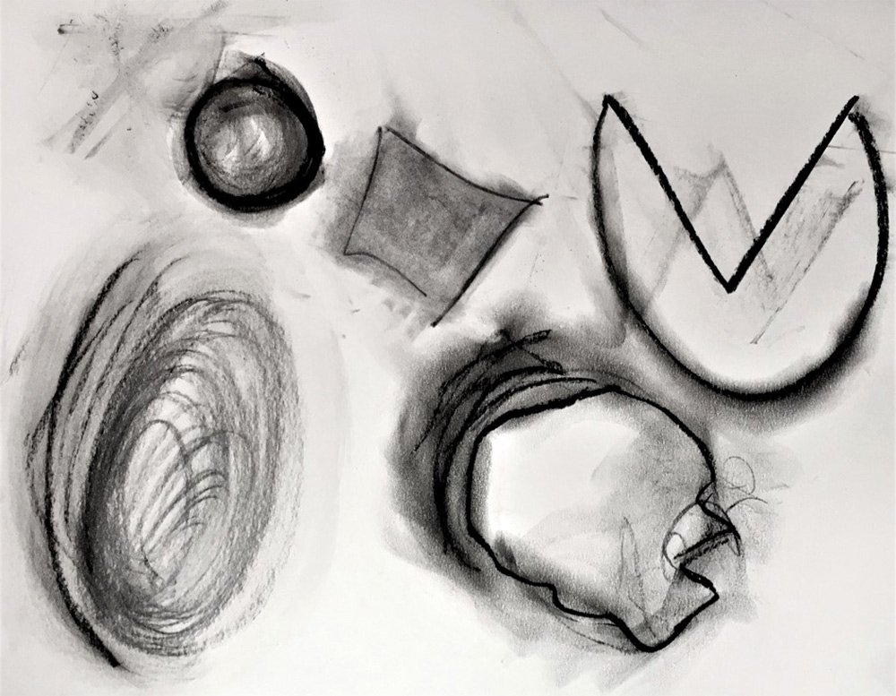
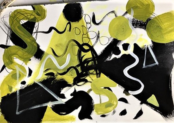
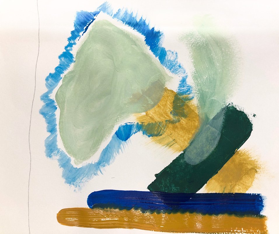
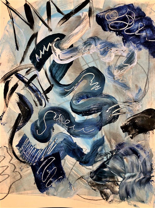
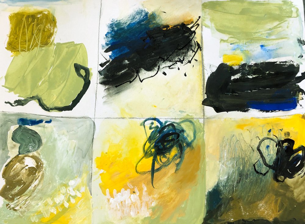
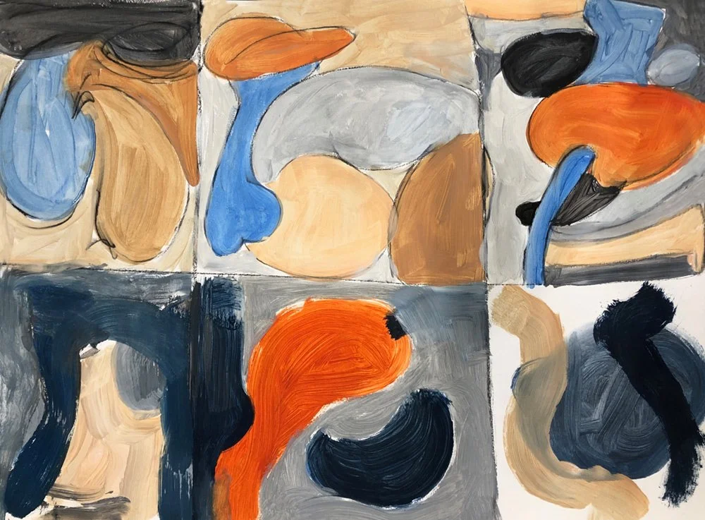
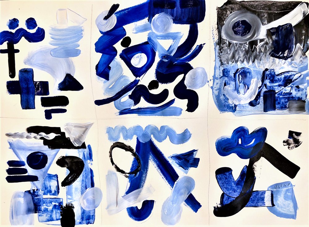
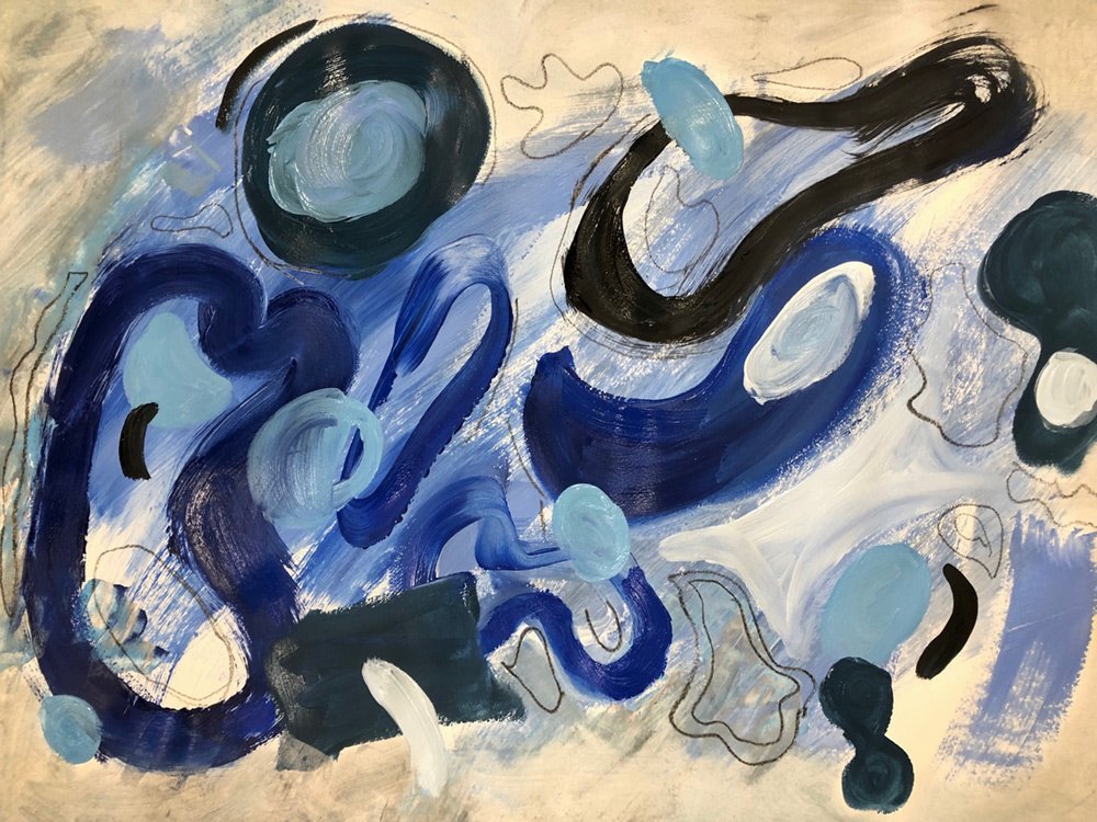
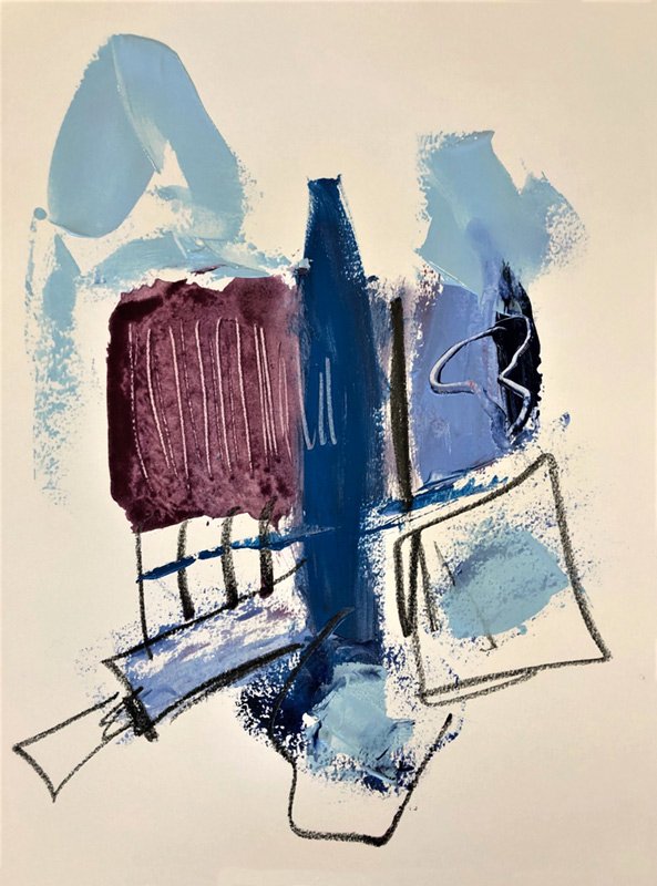
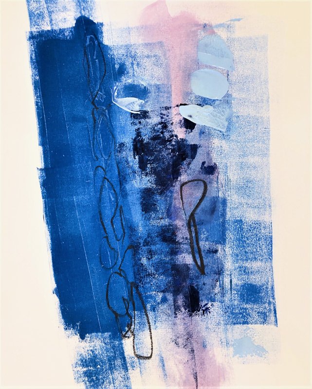
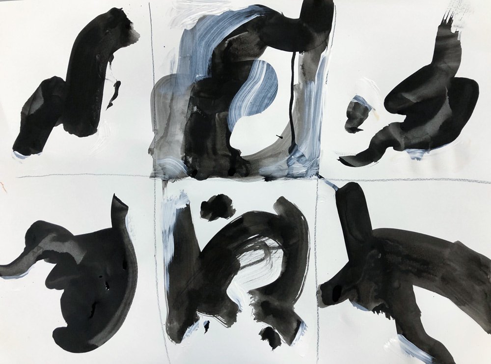
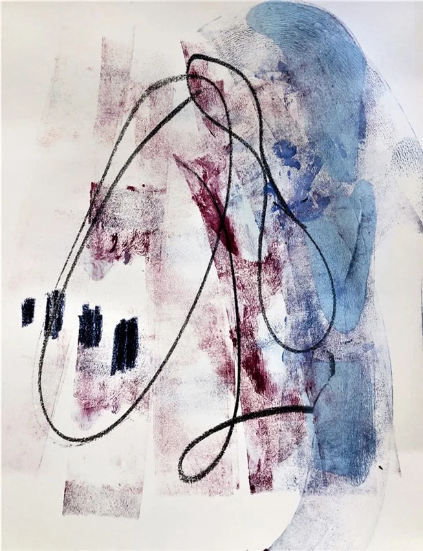
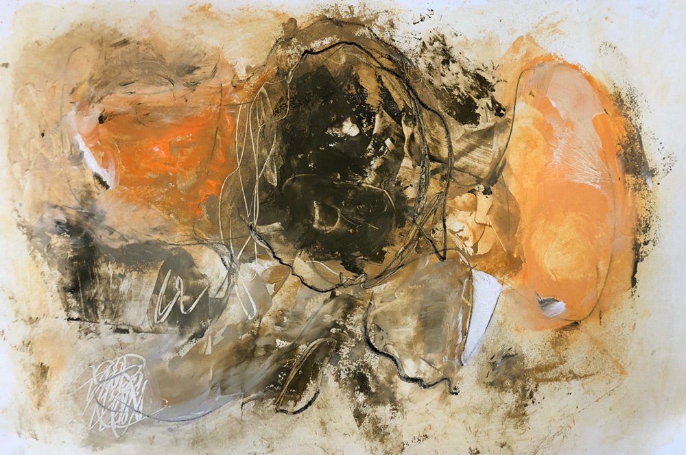
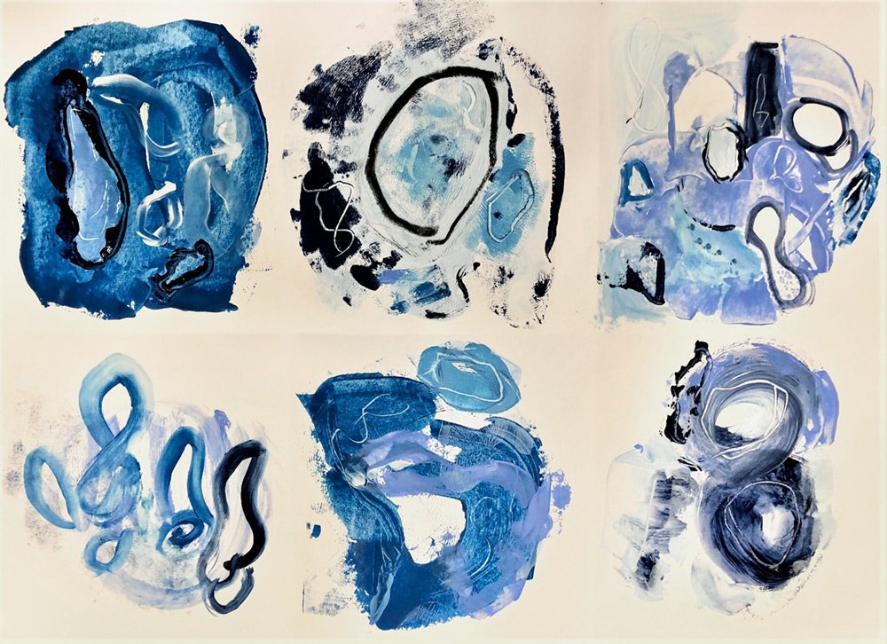
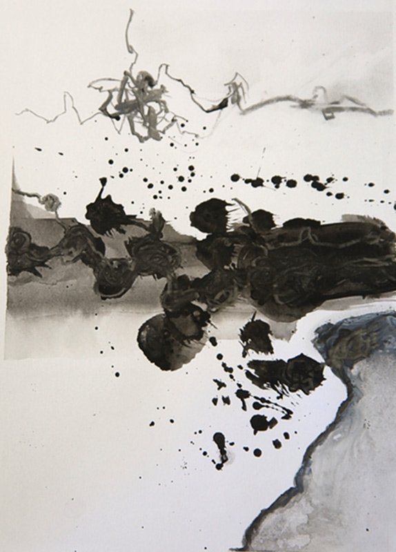
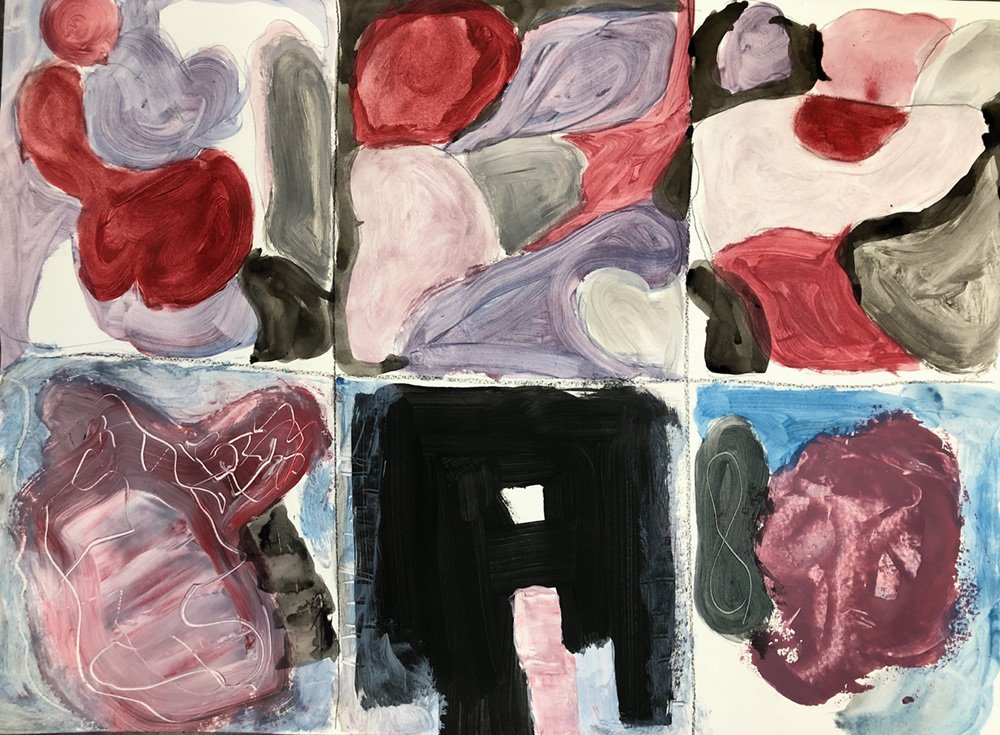
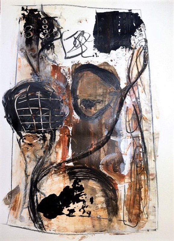
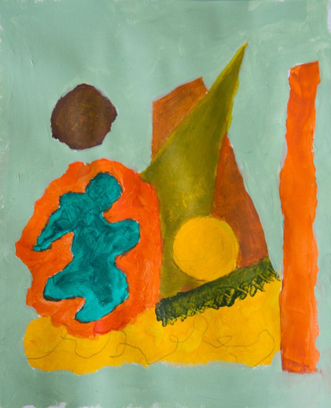
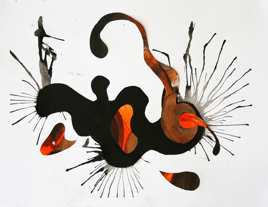
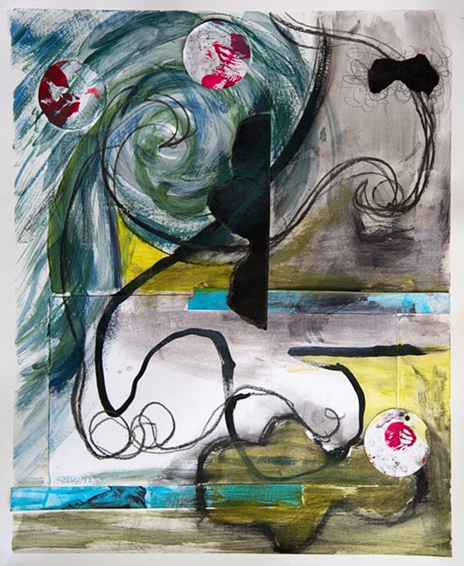
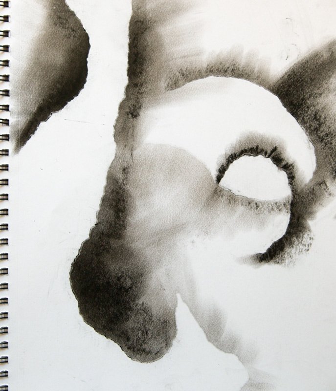
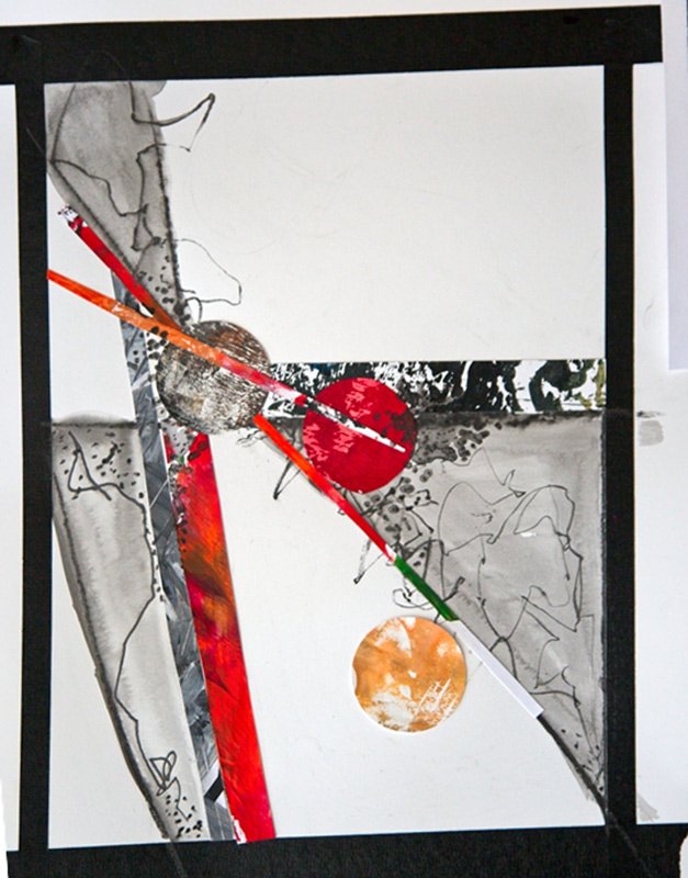
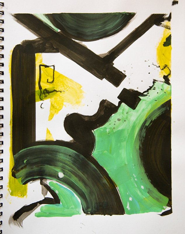
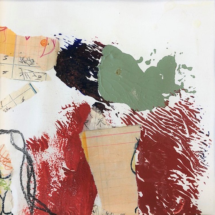
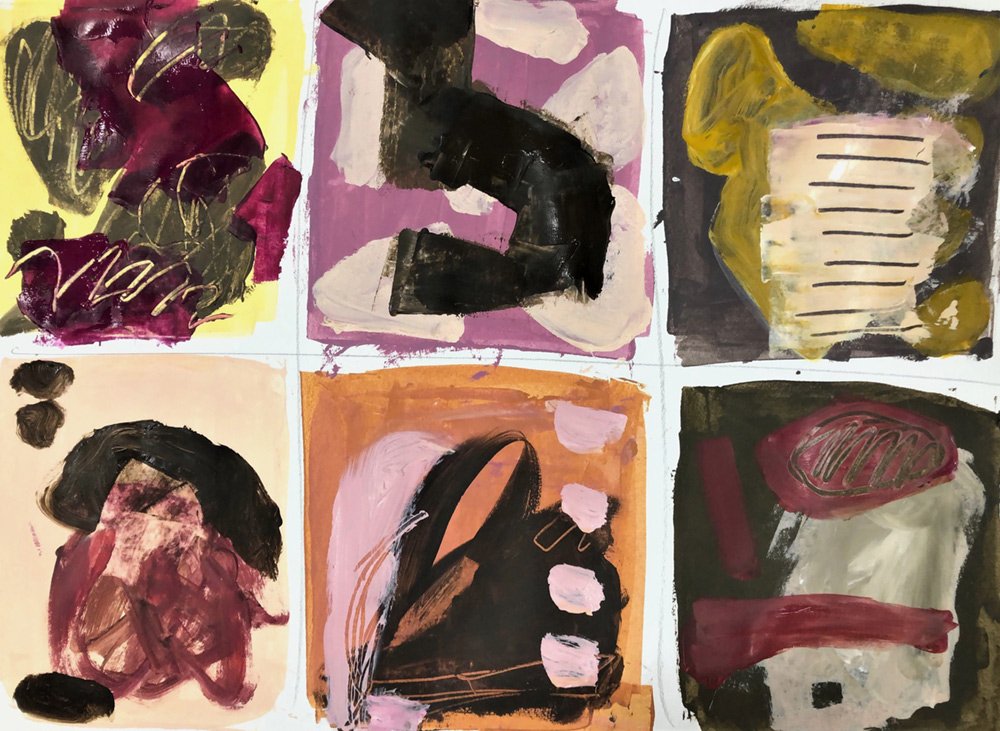
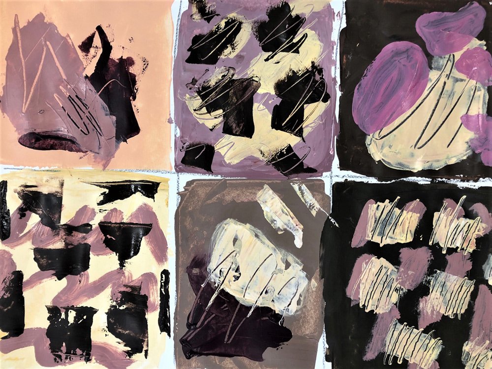
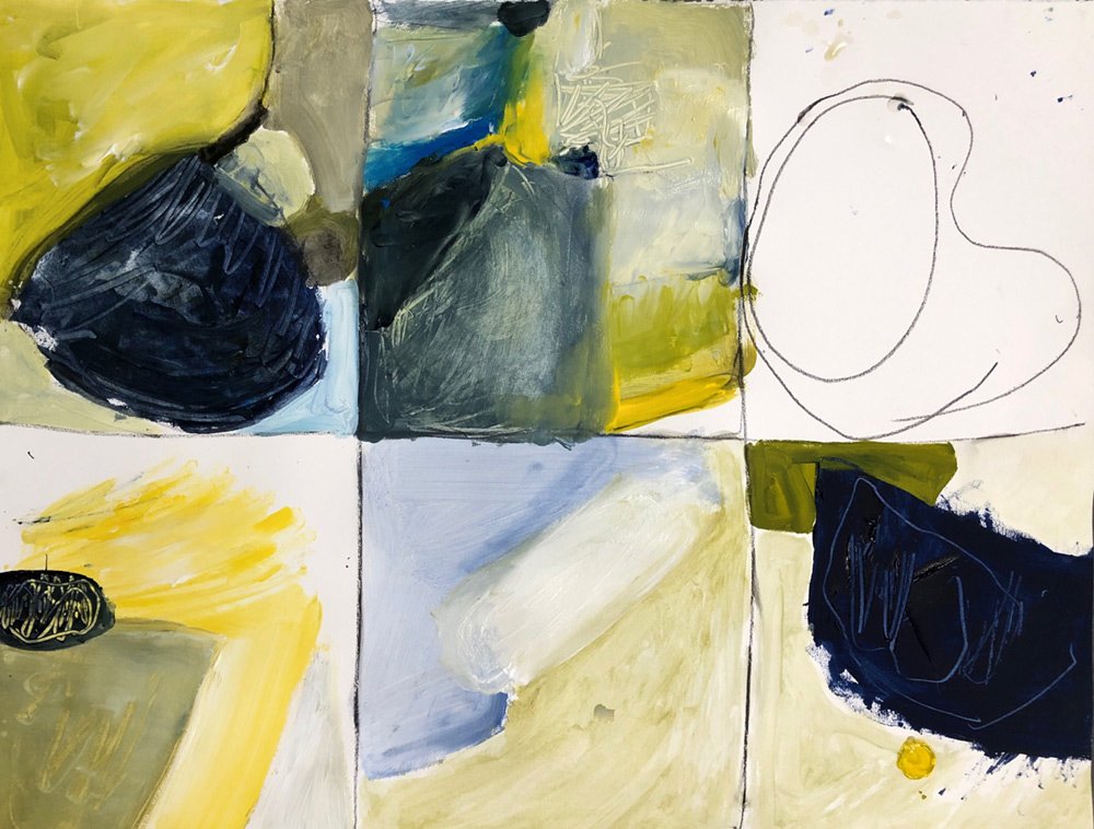
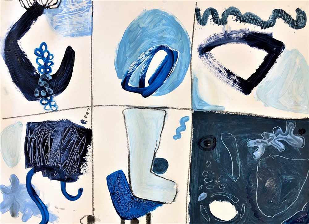
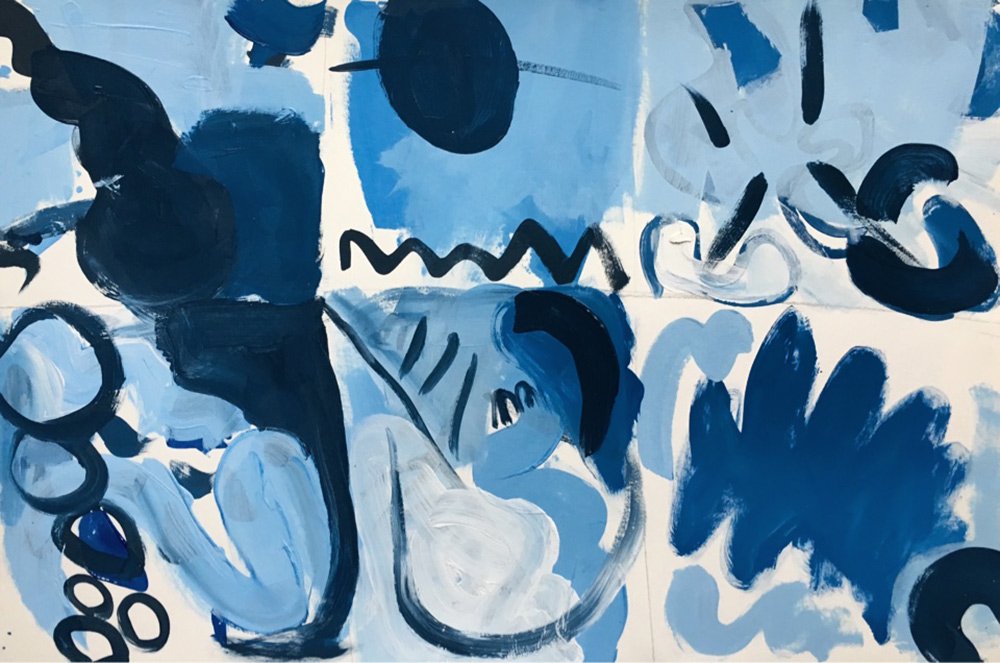
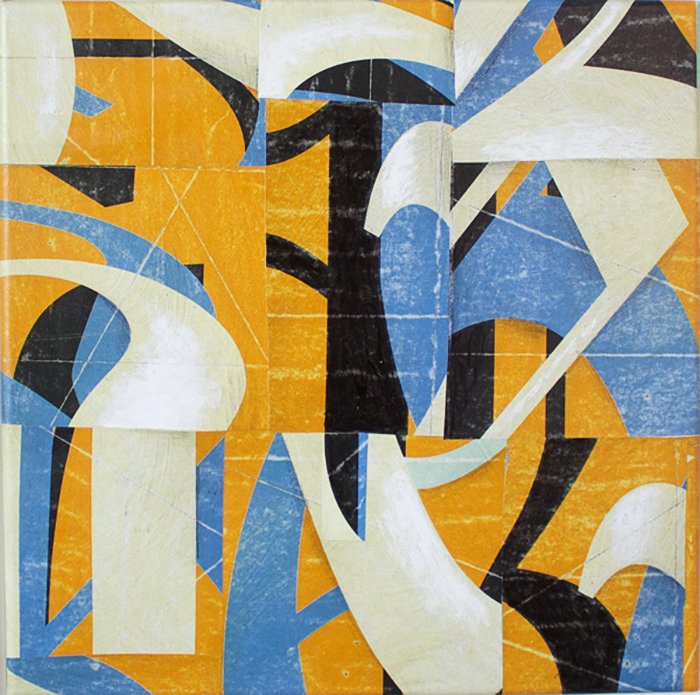
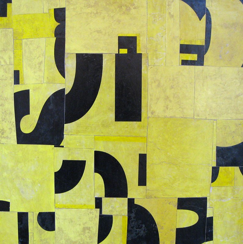
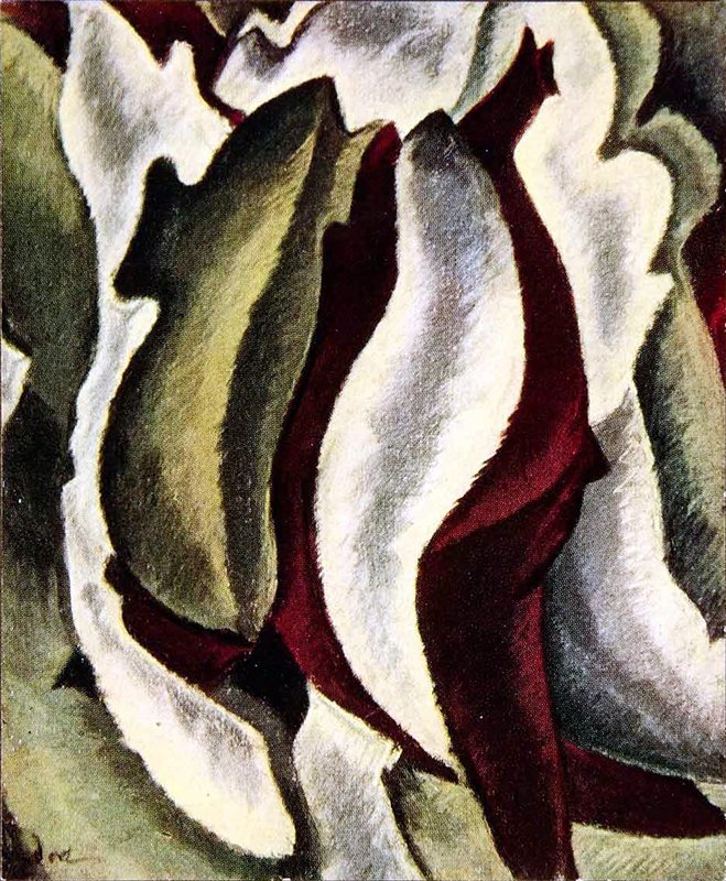
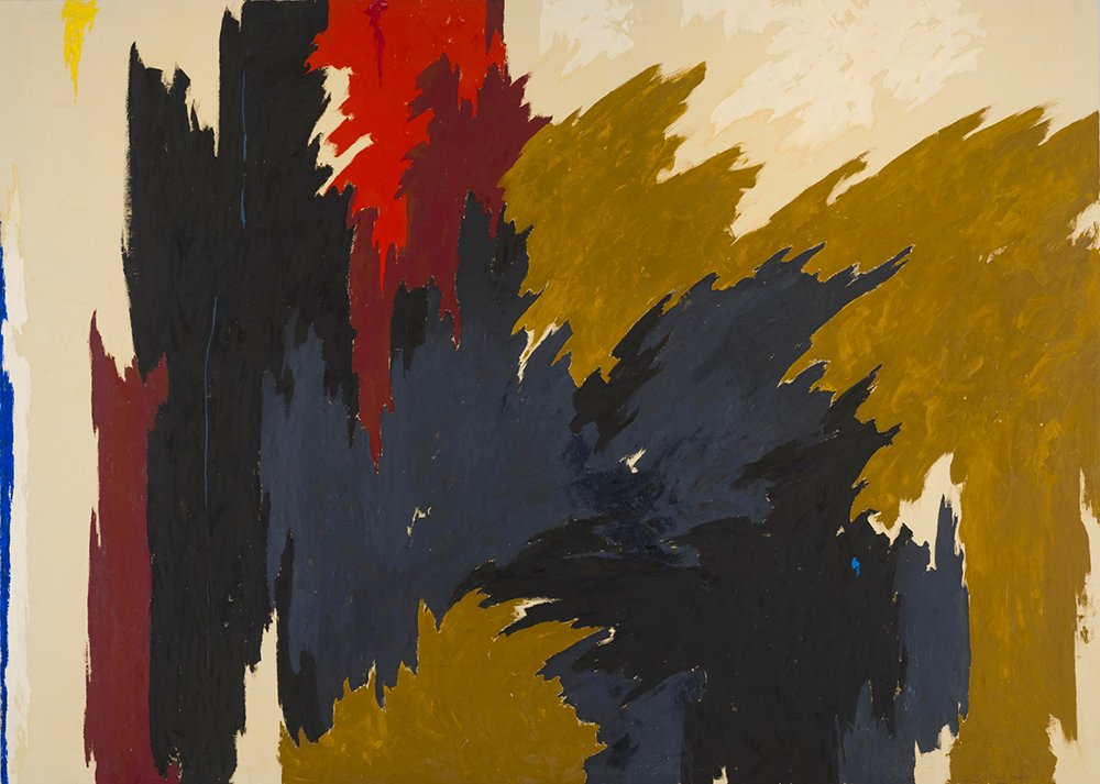
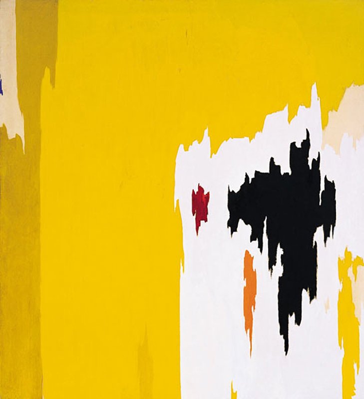
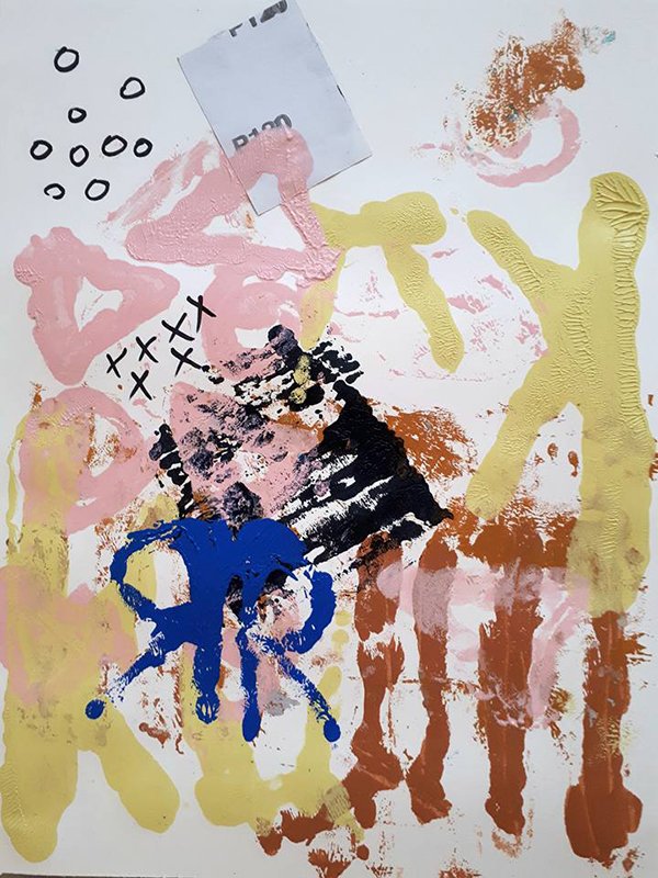
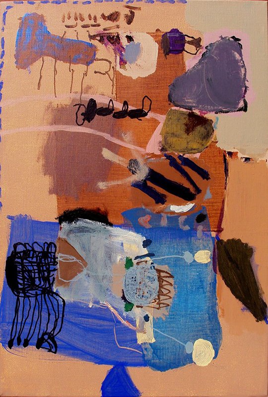
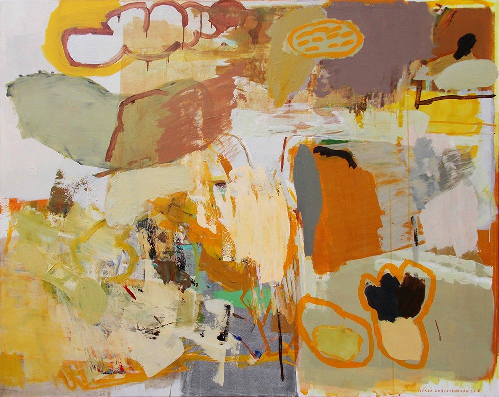
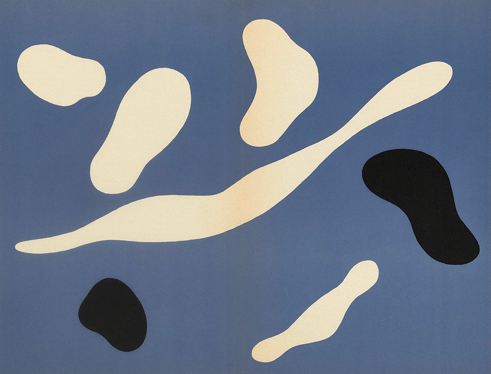
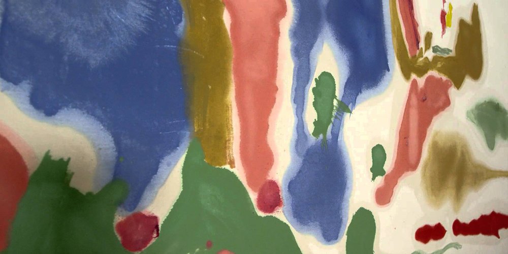
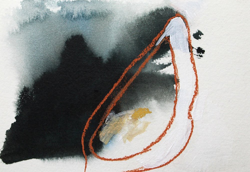
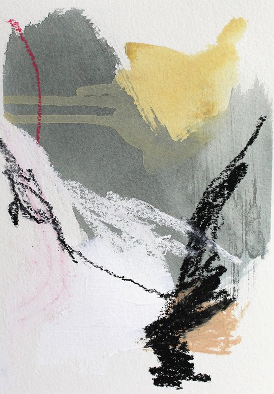
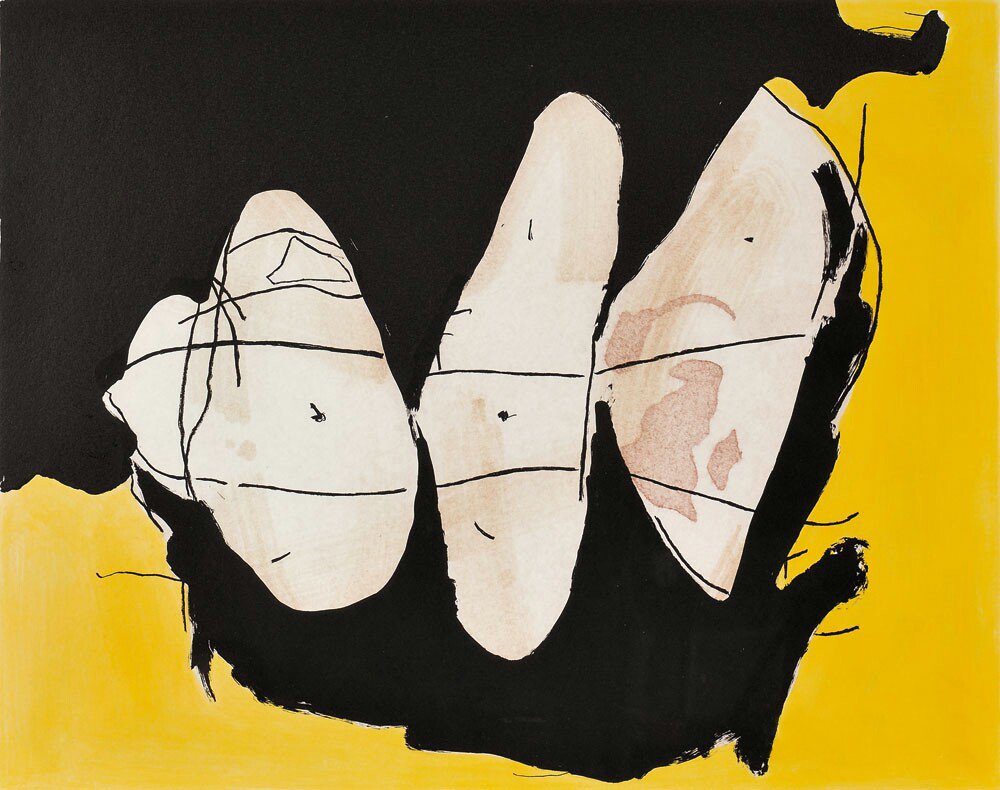
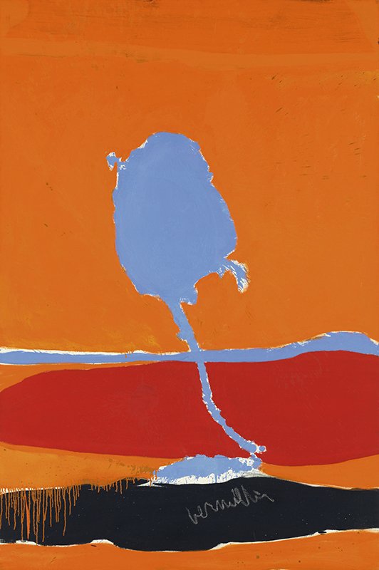
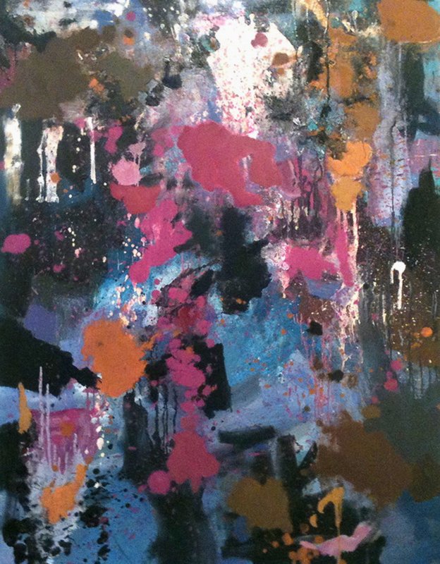
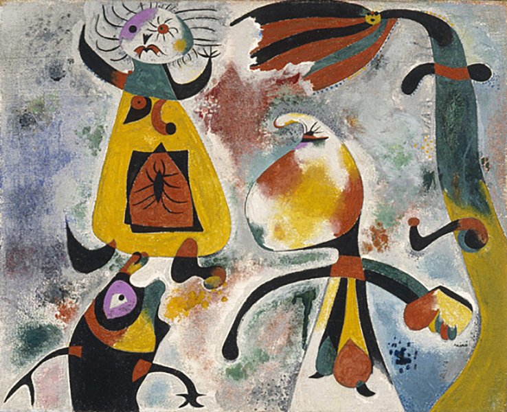
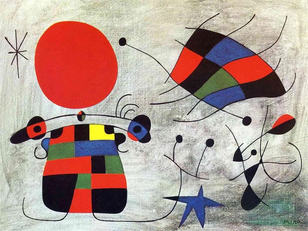
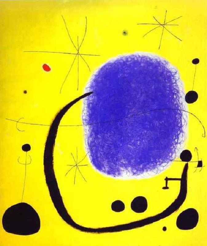
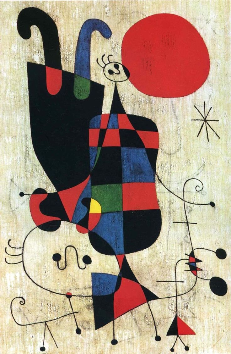
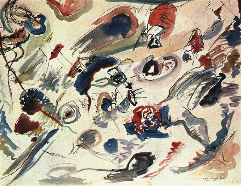
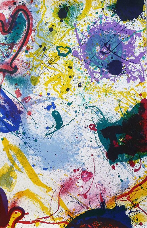
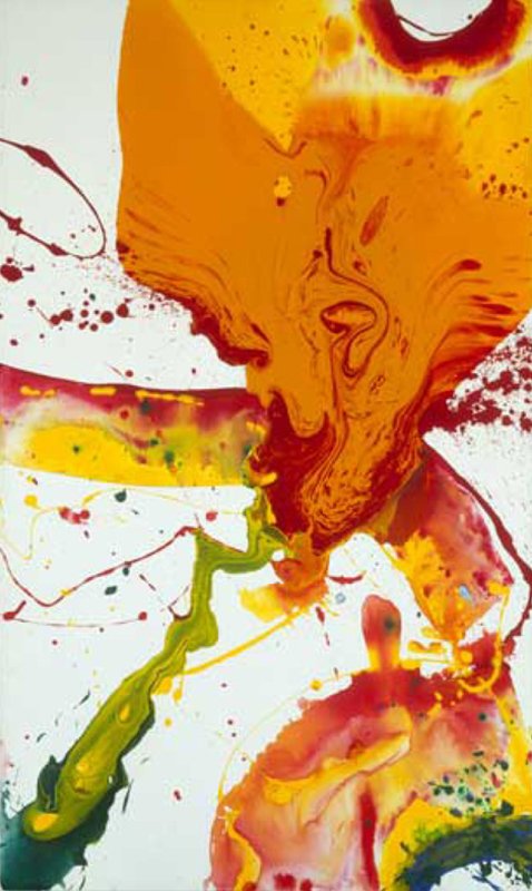
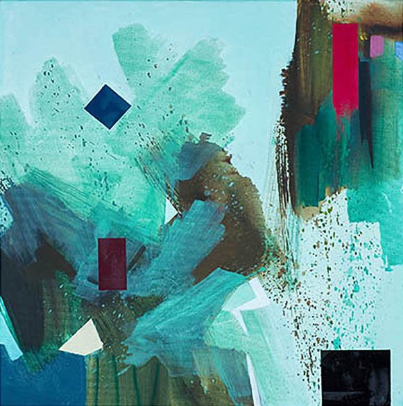
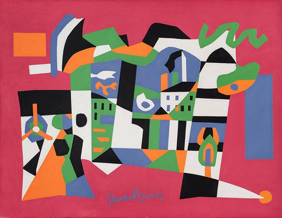
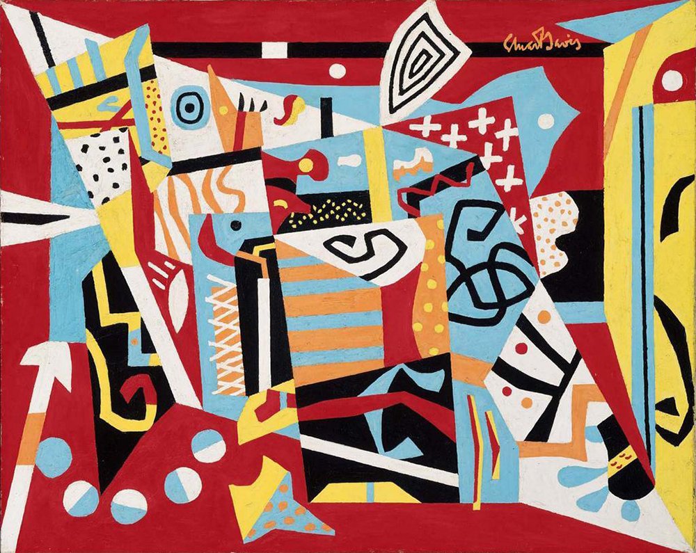
GALLERY
In these student images, we encourage you to pay attention to the kinds of shapes whether geometric and biomorphic, the contrasting sizes and weights, and textures. Notice that some shapes are flat and 2-dimensional and others are articulated and appear 3-dimensional. Notice too, how the shapes set up relationships between one another. The nature of the relationships may be merging, pulling away, tangential, overlapping, etc. There is an energy exchange between shapes. How do these relationships make you feel? Does this give you information on how important shape and contrast can be in your own paintings?
Lots to look at and contemplate here in this gallery slide show.